


By Nick Sindt / Senior Shirt Correspondent
With the MLS season about to dawn, we at the Free Beer Movement thought we’d sit down and evaluate this season’s offerings for those who are unabashed kit-nerds like us. Hey it’s part of the US Soccer culture, right?
(I will do my damndest to refrain from lambasting the ALL ADIDAS ALL THE TIME motif in MLS. In truth that contract is great for the league, and thus the American game in general, but I’ve been drinking whilst composing this so I make no promises.)
To rate all of the kits (new and last year’s offerings that will be kept due to the two-year agreement between MLS and adidas) I will be making suggestions on what type of beer to toast each kit and its sponsor with:
Lowest of the Low = Macro-Brewers who produce flavored beers to be represented by Bud Light Lime. You’re on thin ice; one step away from being toasted with two 40oz-ers of Zima. Heretofore referred to as Bud Light Lime.
Below Average = Macro Brews like Miller Lite and Bud Light. You have your place and time, and I appreciate everything you did for me in college, but really it’s time to add some depth, nuance (Lime is not a nuance), and maturity to yourself just like I purport to have done. Heretofore referred to as Miller Lite.
Average = Macro-Micro Brews like Same Adams, Leinenkugels, etc. You’re pretty widely distributed because you’re easy on most palates but restaurants still up-charge you as if you’re a Micro-brew simply because you’re not Miller or Bud. Heretofore referred to as Sam Adams.
Above Average = Micro/Craft Breweries. Pick your favorite local small-time brewer’s year-round offerings and toast the kit designers for a job well done with your go-to grown-up beer. Heretofore referred to as New Glarus Moon Man.
Best of the Best = Seasonal Micro/Craft Brews that you wait all year long for and are willing to shell out the extra scratch for. It’s so good it’s worth it, so raise a glass with your best can/bottle/glass of suds because even if it’s not your team this is a classy shirt and deserves its due. Heretofore referred to as Surly Abrasive.


Home
The new home shirt for 2012 is quite simply a class act: a) the sash is not a design element anyone else in MLS uses, b) the detailing within the sash makes this pretty badass to wear off the field (let’s be honest you won’t see it on the TV feed or from the stands), and c) the shade of blue is not Crayola “Blue” nor is it Crayola “Navy” which adds to the depth of the shirt. Let’s be honest, did you expect anything less for the team that has David Beckham, Landon Donovan, and 8 or 9 other DPs if they so desired?
Kit = Surly Abrasive
Sponsor = Miller Lite – Not a huge fan of ‘Herbalife’ spelled out, the logo would be better from the design side of things but the sponsor name spelled out likely works better with the sash…
Away
As an away shirt, it acts as an ok compliment to the home one. On its own the only thing saving it is the different shade of blue, otherwise this is pretty tame.
Kit = Miller Lite
Sponsor = Miller Lite – Given the plainness of this template a more design-esque sponsor could definitely help this shirt out.
Third
Like all shirt manufacturers, adidas has a boring template to slap some colors on when necessary, and this is one of those times. As boring as the template is the hubris behind the black and metallic gold totally redeem it for me.
Kit = New Glarus Moon Man
Sponsor = Miller Lite – Same thoughts as the away shirt.
Portland Timbers


 Home
Home
Bravo adidas. The inaugural shirt for the Portland Timbers was beyond well done. Two-tone coloring on the body of the shirt and white sleeves are above and beyond most MLS shirts, throw in the chevron detailing in between the two different greens and this shirt just hits a whole new level.
Kit = Surly Abrasive
Sponsor = New Glarus Moon Man – Maybe I’m a touch biased by how nice the rest of the shirt is, but the sponsor’s name being large doesn’t bother me. It could be due to the font, possibly the good beer I had earlier tonight.
Away
If the home shirt is on a different level from the rest of MLS, this one will force the Poet Laureate to create some new adjectives to describe it. Keeping many of the same design elements from the home shirt – two-toned body, white sleeves, and awesome detail separating the two shades of red (thorns this time) – adidas wins again with the ‘Rose City’ inspired away shirt. My only complaint is that I’d have to shell out an extra $40 to get the Rose City logo on the right chest of the shirt as adidas’s “replica” shirts don’t have them.
Kit = Surly Abrasive
Sponsor = New Glarus Moon Man – Same commentary as the home shirt.
Third
The 2012 3rd kit for Portland is something straight out of that 70s show. Like the frosted mini-wheats commercials of yore, the adult in me appreciates the nod to the past, while the kid in me is somewhat confused about this radioactive, highly flammable material (I know it’s not old-school polyester. I know you wouldn’t make players play in that kind of shirt). All in all, not a bad effort, but without other teams following suit this feels a touch out of place in the league. As a shirt to wear outside of MLS games or watch parties, it’s not horrible but takes a certain bit of style to pull off; who knows maybe everyone in Portland has that style.
Kit = Sam Adams
Sponsor = New Glarus Moon Man – Fitting for the era and the shirt.
FC Dallas

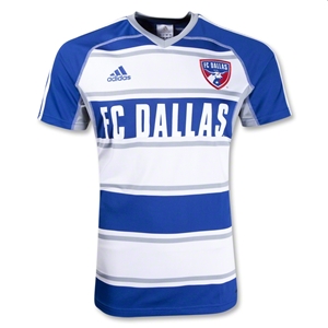
Home
Like the Rapids, the Dallas Burn went through a re-branding a few years ago to become FC Dallas Giant Steer Heads (‘There’s only two things in Texas…’ ). Along with the name change was a switch from the sanitized MLS solid-colored shirt to become the first MLS team with hoops, a la Celtic and others. Since that time adidas has shown some invention with Dallas’s hoops and while not everything is a home run, neutrals like me at least appreciate the effort. The 2012 edition of the home shirt is an almost brilliant offering. The small “border” striping for the thick hoops not only gives the shirt a touch of nuance, but it also furthers adidas’s three stripes everywhere-all-the-time motif. The collar is a nice touch for the shirt that isn’t being used much elsewhere throughout MLS. If I were to nit-pick the extra three stripes along the shoulders is a bit much of adidas’s branding on the shirt.
Kit = New Glarus Moon Man/Surly Abrasive
Sponsor = N/A – FC Dallas across the chest is a bit reminiscent of other US sports, especially high-school and college teams; when in doubt follow Atletico Madrid/San Jose’s lead and go without a shirt sponsor.
Away
Same template but with blue as the primary color and the detailed, smaller hoops are grey which is a nice alternate look – not radically different away colors but not as humdrum as other MLS away offerings where the home color becomes trim on a white shirt. The collar is slightly different from the home shirt, and FC Dallas appears to be larger text across the chest. Other than the text sizing looking weird (could just be the MLSGear.com website picture), this is a solid away effort.
Kit = New Glarus Moon Man
Sponsor = N/A – Same thoughts as the home shirt.
Chivas USA


Home
2012 sees CD Chivas USA get a new home shirt with a pretty standard vertical stripe shirt with a navy collar. When a team has stripes or hoops as their tradition it’s tough to do anything that’s vastly different from years before; though adidas is definitely trying with the GrinGoats. Though a pretty standard offering in terms of stripes, the collar is a nice addition and elevates this shirt up to the borderline between middle of the road and just above.
Kit = Sam Adams/New Glarus Moon Man
Sponsor = Corona I mean New Glarus Moon Man – I’m not a fan of Corona as a beer but I like to see beers sponsoring the league and the continued tie-ins with Mexico make it an interesting choice.
Away
On its own the away shirt is not bad, sublimated vertical stripes on a solid blue shirt. However, as the away/compliment to the home shirt, this is a better-than-solid effort though a little too much white trim.
Kit = Sam Adams
Sponsor = New Glarus
Real Salt Lake

 Home
Home
Last year’s RSL kit wasn’t horrible, but it wasn’t great either – just a shade below middle of the road. This year’s effort continues adidas’s trend away from conformity and tosses the navy blue trim onto a single sleeve. Not too shabby; though, would’ve been better if the adidas three stripes had also followed suit and gone to the single, navy sleeve.
Kit = Sam Adams/New Glarus Moon Man
Sponsor = Miller Lite – From a looks perspective Xango doesn’t add much to the shirt. From marketing their own name and brand perspective, I have googled this company a few times because I’m intrigued about what they do or make.
Away
Same template as the home shirt but back to the boring white away idea. The single sleeve spruces it up a touch and it’s definitely an improvement from last year’s 98%-white-with-a-few-splashes-
Kit = Miller Lite/Sam Adams
 Sponsor = Miller Lite – Same thoughts as the home shirt.
Third
Last year’s garish bright yellow 3rd kit returns (I think) for the 2012 season. It’s tough to form an opinion on this shirt…on the one hand that color is extremely loud and the shirt template is pretty basic. On the other it’s a third kit and it’s supposed to be somewhat “different.” Regardless of your opinion, I think we can all agree that this shirt is definitely not part of the usual boring dreck that we see in MLS.
Kit = Sam Adams
Sponsor = Miller Lite – Same thoughts as the home shirt.
Vancouver Whitecaps


Home
Whitecaps FC’s inaugural home shirt is an interesting take on the horizontal stripes/hoops idea though I think adidas should’ve pushed the envelope a bit with the thickness of the stripes to make more of an impression. With the current stripes these shirts appear (from afar) to be just a white shirt with a modicum of blue trim; it’s a step up from boring but not by much.
Kit = Sam Adams
Sponsor = Sam Adams – not sure who Bell is or what they do, but thankfully BMO isn’t sponsoring every team north of the border.
Away
One word describes this kit perfectly: Almost. A quick glance and you think this is a typical solid blue shirt with some adidas stripes. Upon closer inspection there is a nice sublimated pattern on the shirt that appears to be an interlocking of the club’s crest. However, the sublimation hardly stands out against such a dark background. Again, if the envelope had been pushed to create a little more contrast (think Olympique Marseille’s argyle away shirt from 2009 but less ostentatious) this could’ve been a great shirt.
Kit = Sam Adams/New Glarus Moon Man
Sponsor = Sam Adams
Colorado Rapids


Home
A couple of years ago the Rapids re-branded themselves with a new crest and a new color scheme. The maroon and frosty blue are a breath of fresh air in a league that seemed, prior to the Western Corridor getting involved, hell-bent on only using Caryola’s 8 standard colors. That being said, this home shirt (a hold-over from 2011) is a little too “clean” for my tastes; the only splash of the secondary color is on the crest. Whereas the Crew home shirt has a collar and the black “pops” against the yellow, the white is a weak compliment if only utilized for the 3 stripes. A splash more of the secondary color and this could have been a solid offering.
Kit = Miller Lite
Sponsor = N/A – Could one add to this shirt? Possibly, but I don’t think it’s necessary.
Away
The same template as the home shirt (and again a hold-over from 2011), but with the club’s primary color adorning the shoulder portion of the shirt and a chevron down the backside. While I can appreciate the touch of color to keep this from being a solid white shirt, it feels like a different direction could’ve been taken with this; possibly an Arsenal/West Ham/Aston Villa-like base with different-colored sleeves…especially considering the tenuous connection between the Rapids and Arsenal. Overall, this shirt is on the same level as the home one, but just barely.
Kit = Miller Lite
Sponsor = N/A – Could one add to this shirt? Possibly, but I don’t think it’s necessary.
San Jose Earthquakes


Home
Last year’s home shirt had the same template as RSL’s Third shirt but with more color variation, which was not too bad except for all of the white detailing standing out too much against the black. This year’s shirt is much, much more basic. Removing the white piping detail to have simply a black shirt with blue trim (aside from the white adidas striping on the shoulders) actually made San Jose’s shirts better. Though, it’s still pretty plain.
Kit = Miller Lite
Sponsor = N/A – Could one add to this shirt? Possibly, but I don’t think it’s necessary.
Away
Same template different color. From a uniform perspective, this is a much improved effort on the basic white shirt from last season – you’ve figured out by now that I hate white away shirts for white away shirt’s sake. However, the white shirt appears to be more wearable by the fan base than this effort.
Kit = Miller Lite
Sponsor = N/A – Could one add to this shirt? Possibly, but I don’t think it’s necessary.
Seattle Sounders


Home
I have a gut feeling (not based on any research or discussions) that Seattle is attempting to be the front-runner in EVERYTHING for MLS, which is great for the club, the league, and the fans. However, with their shirts for the 2011 and 2012 seasons, I get the feeling that they’ve jumped the shark a bit. What are those silver things; backpack straps? Is it supposed to be futuristic like a Delorean and hover boards? Remove that weirdness and this is not a bad solid-color-with-trim shirt especially given Seattle’s color choices.
Kit = Miller Lite
Sponsor = Sam Adams
Away
Same template as the home, but I’m digging this charcoal-navy color combination. Remove those backpack straps and this would be a very solid away shirt.
Kit = Miller Lite/Sam Adams
Sponsor = Sam Adams
Third
This shirt makes RSL’s Big Bird 3rd shirt look tastefully fashionable. I have no words in my to describe these colors, aside from “oh my god, my eyes, they’re bleeding.” The collar and color panels help keep this template from being boring-ish with normal colors. Seattle & adidas’s choices for the third shirt colors will ensure that this kit will at least be talked about. Biggest question, will TV cameras be able to pick up the players against the bright green turf of Qwest Field.
Kit = Bud Light Lime
Get the NEW Free Beer Movement "Pint Glass" shirt! Only from Objectivo.com
I agreed with your impression of Seattle's third kits before I saw them in person. In action, they actually look quite nice. Hard to believe, I know.
ReplyDeleteJust a quick note: the shirt pictured above is NOT FC Dallas' away shirt. The picture above is the dumbed-down 'call-up' shirt.
ReplyDeleteHere is a link to the FCD Away shirt:
https://twitter.com/#!/RedShamrockFCD/status/175358141867896833/photo/1
Anon1 - I'll have to take your word for it, seeing them on TV the other night was painful.
ReplyDeleteAnon2 - I thought that 'call-up' titling on the MLSGear website was a bit off. So my new rating of the FCD Away shirt ratchets up to New Glarus Moon Man/Surly Abrasive.