By Nick Sindt / Senior Shirt Correspondent
With the MLS season about to dawn, we at the Free Beer Movement thought we’d sit down and evaluate this season’s offerings for those who are unabashed kit-nerds like us. Hey it’s part of the US Soccer culture, right?
(I will do my damndest to refrain from lambasting the ALL ADIDAS ALL THE TIME motif in MLS. In truth that contract is great for the league, and thus the American game in general, but I’ve been drinking whilst composing this so I make no promises.)
To rate all of the kits (new and last year’s offerings that will be kept due to the two-year agreement between MLS and adidas) I will be making suggestions on what type of beer to toast each kit and its sponsor with:
Lowest of the Low = Macro-Brewers who produce flavored beers to be represented by Bud Light Lime. You’re on thin ice; one step away from being toasted with two 40oz-ers of Zima. Heretofore referred to as Bud Light Lime.
Below Average = Macro Brews like Miller Lite and Bud Light. You have your place and time, and I appreciate everything you did for me in college, but really it’s time to add some depth, nuance (Lime is not a nuance), and maturity to yourself just like I purport to have done. Heretofore referred to as Miller Lite.
Average = Macro-Micro Brews like Same Adams, Leinenkugels, etc. You’re pretty widely distributed because you’re easy on most palates but restaurants still up-charge you as if you’re a Micro-brew simply because you’re not Miller or Bud. Heretofore referred to as Sam Adams.
Above Average = Micro/Craft Breweries. Pick your favorite local small-time brewer’s year-round offerings and toast the kit designers for a job well done with your go-to grown-up beer. Heretofore referred to as New Glarus Moon Man.
Best of the Best = Seasonal Micro/Craft Brews that you wait all year long for and are willing to shell out the extra scratch for. It’s so good it’s worth it, so raise a glass with your best can/bottle/glass of suds because even if it’s not your team this is a classy shirt and deserves its due. Heretofore referred to as Surly Abrasive.
Eastern Conference
Chicago Fire
Home
Much improved effort on past years. The blue swath across the chest in place of the white makes this look a lot less rec-league – think about it every rec-league style kit template that all manufacturers put out is <Some Color> and White. The collar is a nice touch of class for an organization that is near and dear to my heart. The only downside is adidas continuing to kick us in the teeth with their three stripes down the sleeves and the sponsor; I’m happy Quaker is getting involved in the game and working to fight childhood obesity, but the quaker face and name does not inspire.
Kit = New Glarus Moon Man (but only just barely or barley, as it were)
Sponsor = Bud Light Lime
Away
Wow, if the home kit is much improved over past years, this is an SAT analogy where iPod : Record :: Chicago Fire 2012 Away Kit : X!!!! Hint: Burlap sack is the front-runner in a Gallup Poll, just ahead of Mitt Romney for the GOP nomination…I digress.
The navy shirt, as opposed to plain old white with some home color trim is miles ahead. Adding the horizontal Carolina Blue pin-striping broken up by the four six-pointed stars takes this to a whole new level. Sure you can find fault with the sponsor and the number of times the “Chicago” stars are found on the shirt (it is a touch “heavy-handed” in cooking terms), but overall this is a class shirt and I might have to take some money out of my daughter’s college fund to buy this thing. Well done adidas!
Kit = Surly Abrasive
Sponsor = Sam Adams
Columbus Crew
Home
Columbus’s home shirt is YELLOW with some black trim, we get it. 2012’s edition is a decent enough shirt with a collar to make it suitable for wearing out and about or to the golf course. Is it different from last year's? Yes, but who amongst you that isn’t a die-hard Crew fan would know that? Not many. Columbus’s new sponsor is a bit of a detractor as it takes away from the overall look and presentation of it all.
Kit = Miller Lite
Sponsor = Bud Light Lime
Away
As with Chicago’s Away Kit, Columbus’s is simply a wow all on its own. Adidas, I get what you’re trying to do here (throwback to the original MLS Crew shirt without being an exact match), I really do, but this is a miss/defect/travashammocery of Shakesperean proportions. Why do the Black and Yellow horizontal bars stop right above Chad Marshall’s nipples? I mean Sofia Vergara could ‘make it work’ but the beer swilling inhabitants of Crew Stadium…not so much. What happened to mostly black with some yellow trim? That kit would at least make me look trim.
Kit = Bud Light Lime
Sponsor = Bud Light Lime
Home
Glory Be!!!! There’s Red in them thar shirts. For the first time in a long time, DC United’s other color, red, gets to play more than a passing role in their home shirts. Not a fan of the weird neck/collar spikes, the bicep cuffs of color, but at least it’s not Black with White. The VW sponsorship not only adds to the shirt but it’s nice to have a major auto maker on the MLS’s side.
Kit = Miller Lite
Sponsor = Sam Adams
Away
It seems the theme for MLS clubs this year is to have a collar on at least one of the shirts. DC Unite obliges on their away kit, which has a nice red collar on a white shirt. For some reason this one bugs me but I can’t pinpoint why. The bicep cuffs and pit-stain trim are red and stand out nicely. Even the concussion I received from three stripes on the arm doesn’t bother me as bad with this shirt. Maybe it’s the complete package…Though, again it’s better than just White with Black.
Kit = Miller Lite
Sponsor = Sam Adams
Third
Utilizing 2011’s 3rd Kit, ALL RED with some black will return for cup competitions. Not a horrible offering, but with red shorts and socks it becomes a bit of an eyesore. What is it with DC and adidas that makes them stray from the original template of black shirt & socks or white shirt & socks with red shorts?
Kit = Miller Lite
Sponsor = Sam Adams
Houston Dynamo
Home
Houston retains the same kits from last season, which have a weird sunburst/Azteca sublimation that I’m not quite getting right now, but it looks decent. Other than the tangerine orange base the only thing this shirt has going on is the adidas trademark three-stripes (we get it already…), a white collar, and the sponsor logo: greenstar, whomever that is. Though I’m not getting the sublimated pattern, the simplicity of this kit is nice. Solid effort when paired with White shorts, in opposition to the solid colored shirt/shorts/socks combo most teams trot out. Plus it doubles as a golf shirt.
Kit = New Glarus Moon Man
Sponsor = Miller Lite
Away
Almost the exact opposite of the home kit, though the sublimated pattern is much more subtle if it’s even there at all…
Kit = New Glarus Moon Man
Sponsor = Miller Lite
Montreal Impact
Home
For the newest entrant into the parity that is MLS, adidas broke out a stop or two. To be honest I haven’t seen this template, yet, but I (and you) probably will on every team adidas outfits throughout Europe, Asia, and the US at some point in the next year or so. Adidas did touch it up with a full-body cross made of fleur-de-lises, of which only the fleur-de-lises represent the city of Montreal. This touch puts it above the offering for Vancouver last term, but well, well below Portland’s kits from their inaugural year.
Kit = Sam Adams
Sponsor = Miller Lite – thankfully someone else sponsors the Vancouver Canucks Whitecaps
Away
Holy Hell!!! Adidas has gone radical with the Away shirt for the new boys; opposite colors from the home shirt on the same template.
Kit = Bud Light Lime
Sponsor = Miller Lite – it adds that splash of red that you need ‘round February in the Great White North, whether you’ve put your neighbor through a wood chipper or slit your own wrists…
New England Revolution
Home
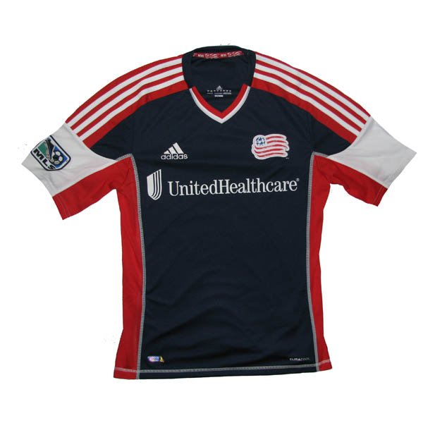
I’m too drunk and bored I can’t be bothered to comment other than there’s 3 colors in the v-neck!!!! The only thing that could make this kit worse is a boring, white-guy, suburbanite sponsor…oops there it is – "United Healthcare". At least the flag of New England redeems the back of the shirt.
Kit = Bud Light Lime
Sponsor = Zima
Away
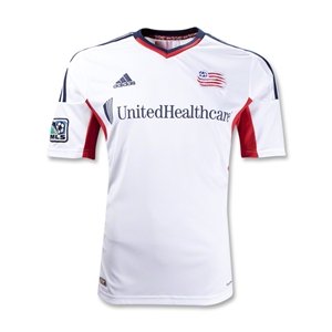
Worse than the home kit. Makes me want to write an angry letter to the Revs front-office. How far you’ve come from the garish, AMERICA-FUCK-YEAH shirts from yesteryear.
Kit = Zima
Sponsor = Zima
New York Red Bulls
Home
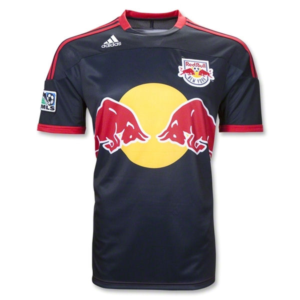
Unlike last year’s patch-work design, this years is the Revs kit with less color. For some reason it doesn’t bother me AS much as the Revs, but I’m still pretty pissed if I’m an NYRB fan who bought last year’s shirt – might as well buy a white t-shirt and screen print your own crest and sponsor onto it.
Kit = Bud Light Lime
Sponsor = Bud Light Lime – the logo is way too big for the shirt and it duplicates design elements from the crest. Snore.
Away
No change from last year’s almost, but not quite as patch-work-y home shirt. The Navy blue is redeeming but the sponsor and adidas’s fascination with their three stripes impedes me from liking this one too much.
Philadelphia Union
Home
So the last two years, the Union have had a weird Star Trek: The Next Generation thing going on. This year they change it up a bit with a more modern interpretation on the solid center-swath of color. The baby blue trim interspersed with the navy base is a nice touch as is the Gold PSG/Center-swath of color. The authentic shirt has a “far-east” style collar that isn’t replicated on the replica shirt (come on adidas, make them one in the same already and quite with your pricing BS) which I haven’t decided on as of yet.
Kit = Sam Adams
Sponsor = Miller Lite – To have to explain this to every woman you encounter gives you an opportunity to grow the sport.("Bimbo? No... Beeembo.") To have to explain this to every woman you encounter makes you wish they had something more degrading, but at least respectable, like an escort service on the front of their shirts.
Away
Same template, but different colors (in a way that’s vastly different from the Montreal Impact). Not sure yet what my thoughts are on that blue being the basis of the jersey, but it continues to pique my interest and it might eventually really grow on me.
Kit = New Glarus Moon Man
Sponsor = Miller Lite
Toronto FC
Home
TFC keeps their Home kit from the previous season which is an Arsenal/West Ham/Aston Villa-esque shirt with a base of one color and sleeves of a different color. There’s nothing remarkable about this shirt but the graphite sleeves draw me in.
Kit = Sam Adams
Sponsor = Miller Lite – we’ve seen this before but in two colors instead of one.
Away
TFC also keeps their Away kit from the previous season, which is very similar to the new Crew Home shirt, except it’s not yellow. And it doesn't have the weird cross-breast tri-color barf-fest. The graphite collar on the white shirt gives this shirt an element of class not seen in other collared shirts adidas has put forth for Eastern Conference MLS foes.
Kit = Sam Adams….almost a Moon Man
Sponsor = Miller Lite
Sporting Kansas City
Home
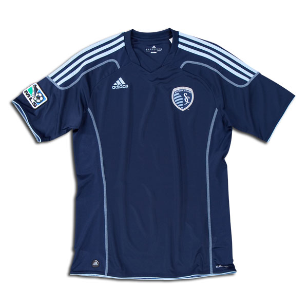
Oh adidas and Sporting KC, how you missed the boat with this one. The new crest and ideology behind the club’s name is great. However, the kit having a seam mimicking the crest without a color differentiation (however slight) is a big mistake. Without a color differentiation, the seam representing the border between Kansas and Missouri is unfathomable unless you inappropriately invade the shirt wearer’s personal space. You’re so close to being above average, but just not enough nuance on this to make it a great kit. Hurts to think that a shade or two darker on one side of the kit takes you from being toasted with a Sammy to a Surly Abrasive, doesn’t it?
Kit = Sam Adams…almost a Surly Abrasive
Sponsor = N/A
Away
Similar to Montreal with opposite colors on the same template, but this one is classier in its subtlety. I still wish there was color variation between the Kansas and Missouri portions of the shirt.
Kit = Sam Adams…almost a Surly Abrasive
Sponsor = N/A


In regards to your Columbus Crew kit criticisms: the away kit is terrible, I agree but the home kit is one of the few in MLS that actually has tradition and has remained nearly unchanged (except for sponsors and Adidas' ever changing templates) from their inaugural season, making it a personal favorite in the league.
ReplyDeleteAnon. Totally respect tradition. That's a really good point I'm sure he didn't consider. Cool!
ReplyDeleteAnon - While I respect tradition, I still don't think that makes this shirt a better shirt. I personally take issue with kit manufacturers creating new kits every year that aren't that different from past iterations, so if it's going to remain unchanged then don't "launch" a new one. Look at what Nike does with Mancheter United's shirts, they're the same but slightly different - is it really worth another $70-90? Not really, and I have the same feelings about this Crew shirt. Keep in mind that I came at this piece without a favorite MLS team, rather commenting on the shirt as it appears to a neutral taking into account style, differentiating nuances, and difference from prior kit.
ReplyDeleteLook at Houston's shirt, basically the same thing but there's some nuance in there that helps it stand out; it's amusing that the Crew used to be spoonsored by Glidden paints because you could say that their typical home shirt is basic 'Flat' yellow with some black trim instead of a nice 'Eggshell.'
As for remaining nearly unchanged from their inaugural season, that's incorrect. For the first few years of the league (mind you no one has put together a perfect pictoral history of this but there's a video on the Crew's website) Black was the predominant home shirt color. The change to all yellow occured in the early 2000's.
Actually the Crew home kit is quite different from last years. Collar added, odd black lines across the top and bottom removed. Sponsor added. Although I would add Adidas makes some pretty horrible kits. If I were a neutral and wanted to select a slick looking kit, I don't think I could get myself to buy one off this list. Well a Crew kit, only because I'm a Crew fan.
DeleteGood on ya'. Support your team even in the ugliest rags (though 1999 would have to qualify as the worst Crew shirt...).
DeleteChicago away kit is the winner for me. Who created the Columbus away and New England kits they are truly disgusting haha. Go Union!
ReplyDeletethis is a cute idea but the end result is so random that its a waste. of course the red bulls logo is big on the red bulls jersey, dumbass, since theyre not just a jersey sponsor, THEY'RE THE NAME SPONSOR OF THE TEAM ITSELF. I also love to read epic length posts where the writer keeps talking about how bored they are while writing. gripping stuff, keep up the great work. I rate this post ONE CAN OF WHAT COMES OUT AN HOUR AFTER A BUD LIGHT LIME.
ReplyDeleteAnon - a few things:
Delete- Red Bulls Logo/Sponsorship - I fully understand that they own (not "Name Sponsor") the club, I'm saying the logo shouldn't be that big, unless you're going to throw it completely off-center and go artsy with it.
- Randomness + Length = "gripping" - It's true there is quite a bit of meandering bloviation going on, but part of the meandering has to do with how all over-the-map the kits and ratings appear when I sorted them alphabetically. Had I sorted them differently it might not have appeared so random. I'll work on that for the Western Conference.
- Boredom - It's true that some of adidas's offerings bored me. Given that this was commentary on the shirts themselves I thought that was fair game to say.
- Your rating of my writing - Touche. But you'll still be back here to see the Western Conference Shirts.
you posted that TFC keeps the same away kit as last year, and comment on the old kit... yet you show the new one that just came out this year, and dont seem to realize... you might want to re-evaluate that whole deal there
ReplyDeletePoster of pics was different than the reviewer. We'll sort it out. Thanks for the heads up.
Deletesee page Our site page Recommended Reading i thought about this find more information
ReplyDeleteofficial site i was reading this you could look here https://www.dolabuy.ru/ More Help look these up
ReplyDelete