Friday, March 16, 2012

FBM Public Service Announcement - Don't Drink Green Beer

0 comments
Don't make a mistake by going with Green.
Tomorrow you're going to wake up and really want a beer. Not that it's all the different than any other day for most of us, but for some terrible reason you're going to feel compelled to throw out common sense and really want  a green beer.


Resist the urge. Please.

Hopefully, you, dear reader, spend the other 364 (or in the case of this year, 365) days of the rest embracing the deliciousness, creativity, and authenticity of craft beer. If you don't, and you spend most of your days drinking macro-brews, you're not the worst person in the world (come on... that's Hitler) then well you can't be helped.

But if you do love your quality craft beer then, please don't be mesmerized by the siren song (or peer pressure) by the marketing gimmick of a "St. Patrick's Day" green beer. You don't like Irish folk dance (maybe you do..) and you might even turn the dial away after hearing U2 for the millionth time tomorrow so why would a little food coloring make a Miller Lite of Budweiser any more tolerable?

Save yourself. Save your friends. Save some strangers. Avoid the urge to drink green beer. Unless of course you've got a craft brewer that makes an authentic green brew (Freetail Brewing Company in San Antonio makes a Spirulina Wit, a naturally green beer).

Find an Irish Stout, a Irish Red, a Guinness in a pinch. If truly lost... drink a bunch of whiskey.

Or try a truly "green beer" in Sierra Nevada. The sixth-largest brewery in the nation is completely self-sustaining and has won California's premier environmental award for businesses five-years running. Even when "craft beer" is hard to find in bars... Sierra Nevada usually can be.

This St. Patty's Day... be crafty like a leprechaun.


Get the NEW Free Beer Movement "Pint Glass" shirt! Only from Objectivo.com

Thursday, March 15, 2012

DrinkWear - Beer Rags? FBM's 2012 MLS Western Conference Kit Preview

3 comments


By Nick Sindt / Senior Shirt Correspondent

With the MLS season about to dawn, we at the Free Beer Movement thought we’d sit down and evaluate this season’s offerings for those who are unabashed kit-nerds like us.  Hey it’s part of the US Soccer culture, right?

(I will do my damndest to refrain from lambasting the ALL ADIDAS ALL THE TIME motif in MLS.  In truth that contract is great for the league, and thus the American game in general, but I’ve been drinking whilst composing this so I make no promises.)

To rate all of the kits (new and last year’s offerings that will be kept due to the two-year agreement between MLS and adidas) I will be making suggestions on what type of beer to toast each kit and its sponsor with:

Lowest of the Low = Macro-Brewers who produce flavored beers to be represented by Bud Light Lime.  You’re on thin ice; one step away from being toasted with two 40oz-ers of Zima.  Heretofore referred to as Bud Light Lime.

Below Average = Macro Brews like Miller Lite and Bud Light.  You have your place and time, and I appreciate everything you did for me in college, but really it’s time to add some depth, nuance (Lime is not a nuance), and maturity to yourself just like I purport to have done.  Heretofore referred to as Miller Lite.

Average = Macro-Micro Brews like Same Adams, Leinenkugels, etc.  You’re pretty widely distributed because you’re easy on most palates but restaurants still up-charge you as if you’re a Micro-brew simply because you’re not Miller or Bud.  Heretofore referred to as Sam Adams.

Above Average = Micro/Craft Breweries.  Pick your favorite local small-time brewer’s year-round offerings and toast the kit designers for a job well done with your go-to grown-up beer.  Heretofore referred to as New Glarus Moon Man.

Best of the Best = Seasonal Micro/Craft Brews that you wait all year long for and are willing to shell out the extra scratch for.  It’s so good it’s worth it, so raise a glass with your best can/bottle/glass of suds because even if it’s not your team this is a classy shirt and deserves its due.  Heretofore referred to as Surly Abrasive.


Home
The new home shirt for 2012 is quite simply a class act: a) the sash is not a design element anyone else in MLS uses, b) the detailing within the sash makes this pretty badass to wear off the field (let’s be honest you won’t see it on the TV feed or from the stands), and c) the shade of blue is not Crayola “Blue” nor is it Crayola “Navy” which adds to the depth of the shirt.  Let’s be honest, did you expect anything less for the team that has David Beckham, Landon Donovan, and 8 or 9 other DPs if they so desired?

Kit = Surly Abrasive
Sponsor = Miller Lite – Not a huge fan of ‘Herbalife’ spelled out, the logo would be better from the design side of things but the sponsor name spelled out likely works better with the sash…

Away
As an away shirt, it acts as an ok compliment to the home one.  On its own the only thing saving it is the different shade of blue, otherwise this is pretty tame.

Kit = Miller Lite
Sponsor = Miller Lite – Given the plainness of this template a more design-esque sponsor could definitely help this shirt out.

Third
Like all shirt manufacturers, adidas has a boring template to slap some colors on when necessary, and this is one of those times.  As boring as the template is the hubris behind the black and metallic gold totally redeem it for me.

Kit = New Glarus Moon Man
Sponsor = Miller Lite – Same thoughts as the away shirt.

Portland Timbers


Home
Bravo adidas.  The inaugural shirt for the Portland Timbers was beyond well done.  Two-tone coloring on the body of the shirt and white sleeves are above and beyond most MLS shirts, throw in the chevron detailing in between the two different greens and this shirt just hits a whole new level.

Kit = Surly Abrasive
Sponsor = New Glarus Moon Man – Maybe I’m a touch biased by how nice the rest of the shirt is, but the sponsor’s name being large doesn’t bother me.  It could be due to the font, possibly the good beer I had earlier tonight.

Away
If the home shirt is on a different level from the rest of MLS, this one will force the Poet Laureate to create some new adjectives to describe it.  Keeping many of the same design elements from the home shirt – two-toned body, white sleeves, and awesome detail separating the two shades of red (thorns this time) – adidas wins again with the ‘Rose City’ inspired away shirt.  My only complaint is that I’d have to shell out an extra $40 to get the Rose City logo on the right chest of the shirt as adidas’s “replica” shirts don’t have them.

Kit = Surly Abrasive
Sponsor = New Glarus Moon Man – Same commentary as the home shirt.

Third
The 2012 3rd kit for Portland is something straight out of that 70s show.  Like the frosted mini-wheats commercials of yore, the adult in me appreciates the nod to the past, while the kid in me is somewhat confused about this radioactive, highly flammable material (I know it’s not old-school polyester.  I know you wouldn’t make players play in that kind of shirt).  All in all, not a bad effort, but without other teams following suit this feels a touch out of place in the league.  As a shirt to wear outside of MLS games or watch parties, it’s not horrible but takes a certain bit of style to pull off; who knows maybe everyone in Portland has that style.

Kit = Sam Adams
Sponsor = New Glarus Moon Man – Fitting for the era and the shirt.

FC Dallas

Home
Like the Rapids, the Dallas Burn went through a re-branding a few years ago to become FC Dallas Giant Steer Heads (‘There’s only two things in Texas…’ ).  Along with the name change was a switch from the sanitized MLS solid-colored shirt to become the first MLS team with hoops, a la Celtic and others.  Since that time adidas has shown some invention with Dallas’s hoops and while not everything is a home run, neutrals like me at least appreciate the effort.  The 2012 edition of the home shirt is an almost brilliant offering.  The small “border” striping for the thick hoops not only gives the shirt a touch of nuance, but it also furthers adidas’s three stripes everywhere-all-the-time motif.  The collar is a nice touch for the shirt that isn’t being used much elsewhere throughout MLS.  If I were to nit-pick the extra three stripes along the shoulders is a bit much of adidas’s branding on the shirt.

Kit = New Glarus Moon Man/Surly Abrasive
Sponsor = N/A – FC Dallas across the chest is a bit reminiscent of other US sports, especially high-school and college teams; when in doubt follow Atletico Madrid/San Jose’s lead and go without a shirt sponsor.

Away
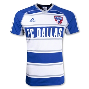
Same template but with blue as the primary color and the detailed, smaller hoops are grey which is a nice alternate look – not radically different away colors but not as humdrum as other MLS away offerings where the home color becomes trim on a white shirt.  The collar is slightly different from the home shirt, and FC Dallas appears to be larger text across the chest.  Other than the text sizing looking weird (could just be the MLSGear.com website picture), this is a solid away effort.

Kit = New Glarus Moon Man
Sponsor = N/A – Same thoughts as the home shirt.

Chivas USA


Home
2012 sees CD Chivas USA get a new home shirt with a pretty standard vertical stripe shirt with a navy collar.  When a team has stripes or hoops as their tradition it’s tough to do anything that’s vastly different from years before; though adidas is definitely trying with the GrinGoats.  Though a pretty standard offering in terms of stripes, the collar is a nice addition and elevates this shirt up to the borderline between middle of the road and just above.

Kit = Sam Adams/New Glarus Moon Man
Sponsor = Corona I mean New Glarus Moon Man – I’m not a fan of Corona as a beer but I like to see beers sponsoring the league and the continued tie-ins with Mexico make it an interesting choice.

Away
On its own the away shirt is not bad, sublimated vertical stripes on a solid blue shirt.  However, as the away/compliment to the home shirt, this is a better-than-solid effort though a little too much white trim.

Kit = Sam Adams
Sponsor = New Glarus

Real Salt Lake


Home
Last year’s RSL kit wasn’t horrible, but it wasn’t great either – just a shade below middle of the road.  This year’s effort continues adidas’s trend away from conformity and tosses the navy blue trim onto a single sleeve.  Not too shabby; though, would’ve been better if the adidas three stripes had also followed suit and gone to the single, navy sleeve. 

Kit = Sam Adams/New Glarus Moon Man
Sponsor = Miller Lite – From a looks perspective Xango doesn’t add much to the shirt.  From marketing their own name and brand perspective, I have googled this company a few times  because I’m intrigued about what they do or make.

Away
Same template as the home shirt but back to the boring white away idea.  The single sleeve spruces it up a touch and it’s definitely an improvement from last year’s 98%-white-with-a-few-splashes-of-color away shirt.

Kit = Miller Lite/Sam Adams
Sponsor = Miller Lite – Same thoughts as the home shirt.

Third
Last year’s garish bright yellow 3rd kit returns (I think) for the 2012 season.  It’s tough to form an opinion on this shirt…on the one hand that color is extremely loud and the shirt template is pretty basic.  On the other it’s a third kit and it’s supposed to be somewhat “different.” Regardless of your opinion, I think we can all agree that this shirt is definitely not part of the usual boring dreck that we see in MLS.

Kit = Sam Adams
Sponsor = Miller Lite – Same thoughts as the home shirt.

Vancouver Whitecaps


Home
Whitecaps FC’s inaugural home shirt is an interesting take on the horizontal stripes/hoops idea though I think adidas should’ve pushed the envelope a bit with the thickness of the stripes to make more of an impression.  With the current stripes these shirts appear (from afar) to be just a white shirt with a modicum of blue trim; it’s a step up from boring but not by much.

Kit = Sam Adams
Sponsor = Sam Adams – not sure who Bell is or what they do, but thankfully BMO isn’t sponsoring every team north of the border.

Away
One word describes this kit perfectly: Almost.  A quick glance and you think this is a typical solid blue shirt with some adidas stripes.  Upon closer inspection there is a nice sublimated pattern on the shirt that appears to be an interlocking of the club’s crest.  However, the sublimation hardly stands out against such a dark background.  Again, if the envelope had been pushed to create a little more contrast (think Olympique Marseille’s argyle away shirt from 2009 but less ostentatious) this could’ve been a great shirt.

Kit = Sam Adams/New Glarus Moon Man
Sponsor = Sam Adams

Colorado Rapids


Home
A couple of years ago the Rapids re-branded themselves with a new crest and a new color scheme.  The maroon and frosty blue are a breath of fresh air in a league that seemed, prior to the Western Corridor getting involved, hell-bent on only using Caryola’s 8 standard colors.  That being said, this home shirt (a hold-over from 2011) is a little too “clean” for my tastes; the only splash of the secondary color is on the crest.  Whereas the Crew home shirt has a collar and the black “pops” against the yellow, the white is a weak compliment if only utilized for the 3 stripes.  A splash more of the secondary color and this could have been a solid offering.

Kit = Miller Lite
Sponsor = N/A – Could one add to this shirt?  Possibly, but I don’t think it’s necessary.

Away
The same template as the home shirt (and again a hold-over from 2011), but with the club’s primary color adorning the shoulder portion of the shirt and a chevron down the backside.  While I can appreciate the touch of color to keep this from being a solid white shirt, it feels like a different direction could’ve been taken with this; possibly an Arsenal/West Ham/Aston Villa-like base with different-colored sleeves…especially considering the tenuous connection between the Rapids and Arsenal.  Overall, this shirt is on the same level as the home one, but just barely.

Kit = Miller Lite
Sponsor = N/A – Could one add to this shirt?  Possibly, but I don’t think it’s necessary.

San Jose Earthquakes


Home
Last year’s home shirt had the same template as RSL’s Third shirt but with more color variation, which was not too bad except for all of the white detailing standing out too much against the black.  This year’s shirt is much, much more basic.  Removing the white piping detail to have simply a black shirt with blue trim (aside from the white adidas striping on the shoulders) actually made San Jose’s shirts better.  Though, it’s still pretty plain.

Kit = Miller Lite
Sponsor = N/A – Could one add to this shirt?  Possibly, but I don’t think it’s necessary.

Away
Same template different color.  From a uniform perspective, this is a much improved effort on the basic white shirt from last season – you’ve figured out by now that I hate white away shirts for white away shirt’s sake.  However, the white shirt appears to be more wearable by the fan base than this effort.

Kit = Miller Lite
Sponsor = N/A – Could one add to this shirt?  Possibly, but I don’t think it’s necessary.

Seattle Sounders


Home
I have a gut feeling (not based on any research or discussions) that Seattle is attempting to be the front-runner in EVERYTHING for MLS, which is great for the club, the league, and the fans.  However, with their shirts for the 2011 and 2012 seasons, I get the feeling that they’ve jumped the shark a bit.  What are those silver things; backpack straps?  Is it supposed to be futuristic like a Delorean and hover boards?  Remove that weirdness and this is not a bad solid-color-with-trim shirt especially given Seattle’s color choices.

Kit = Miller Lite
Sponsor = Sam Adams

Away
Same template as the home, but I’m digging this charcoal-navy color combination.  Remove those backpack straps and this would be a very solid away shirt.

Kit = Miller Lite/Sam Adams
Sponsor = Sam Adams

Third
This shirt makes RSL’s Big Bird 3rd shirt look tastefully fashionable.  I have no words in my to describe these colors, aside from “oh my god, my eyes, they’re bleeding.”  The collar and color panels help keep this template from being boring-ish with normal colors.  Seattle & adidas’s choices for the third shirt colors will ensure that this kit will at least be talked about.  Biggest question, will TV cameras be able to pick up the players against the bright green turf of Qwest Field.

Kit = Bud Light Lime


Get the NEW Free Beer Movement "Pint Glass" shirt! Only from Objectivo.com

DrinkWear - Bumpy Pitch "Tavern Tee"

1 comments
Why spend you hard-earned money on green beer this St. Patrick's Day when you can have something waaay more epic and long-lasting. Bumpy Pitch, the California-based soccer lifestyle brand, has dropped another limited edition shirt for the upcoming "drinking holiday". But it's much more than that.
"One of the greatest things about the experience of owning a business is the experiences that you get to have along the way. Luckily for us, the Bumpy Pitch and The Original Winger is a crew of friends that is about much more than what we do as a company. We’ve all been friends for years and we all hold each other down in business and in life. We’re greater than the sum of our parts. 
To celebrate all that that night represented, and the journey, we proudly present the Bumpy Pitch Tavern tee. The inspiration is clearly taken from that St. Patrick’s Day, but it’s also inspired by the idea of celebrating life with your folks. It’s a hectic world we all have to deal with, and sometimes you just gotta stop and enjoy the moment. Speaking of that night, here is a very small slice of what went down…"
Inspired by the look of a pint of Guinness with their own BP twist this shirt is available for just a short time. Be the envy of all your drinking buddies and snag this one first and the call "dibs" on wearing it Saturday night.


Get the NEW Free Beer Movement "Pint Glass" shirt! Only from Objectivo.com

Tuesday, March 13, 2012

VIDEO - Highlights from MLS "First Kick"

0 comments
Goooooooaaaaaals! Saaaaaaaaves! Taaaaaaackles! You get the idea. All the cool stuff from week one of Major League Soccer.
Get the NEW Free Beer Movement "Pint Glass" shirt! Only from Objectivo.com

The Tuesday XI: Erin Go Bragh Edition

1 comments


By "The Other 87 Minutes" / Senior Unemployed English Major Correspondents 


Saturday is St. Patrick's Day (and the birthday of one A.W. Pickard, so if you see him buy him a green beer). In the spirit of the celebration, we've put together a 4-4-2 line-up of Irish writers, historical figures, and Bono. 


GK – Peter O’Toole – Our inspirational leader and captain, his presence is a steadying influence in times of crisis, and his voice can rally the troops when a goal is needed. Our squad members don’t come for money, they come for him.
LB – Wolfe Tone – I admit I’m not entirely sure how his history as an Irish revolutionary would make him a tremendous left back, but isn’t that a badass name?
You better believe he's the first name on the team sheet.
CB – Saint Patrick – Technically speaking, not every one of this team’s attacks start with him. But it sure can seem like it sometimes.
CB – Daniel O’Connell – The other rock at the center of Irish history; no one loves the team more than he does.
RB – Patrick Pearse – A natural defender of his home turf, he only runs into trouble when he pushes too hard for freedom in his role.
LM – W.B. Yeats – Once a center midfielder, but was moved out to the flanks after it turned out the center could not hold when the team relied on his tackling ability to stem the blood-dimmed tide of the opposition’s assault.
CM – Samuel Beckett – Sometimes criticized for his lack of forward passing and drive, but there’s no denying that he sees the game in a completely different way from other players.
Joyce is the only member of our midfield who doesn't have a Nobel Prize. That's quality.
CM – James Joyce – A maddening perfectionist on the pitch, but on his day it seems he can dictate the game down the last detail.
RM – George Bernard Shaw – Endlessly versatile – he won a Nobel Prize, an Oscar, and cofounded the London School of Economics for Pete’s sake – the man tracks back on defense one minute and goes bombing forward the next.
CF – Michael Flatley – And you thought Cristiano Ronaldo’s feet were fast. Dazzles in the attacking end with his rapid-fire combinations.
CF – Bono – May lack the urgency he once felt, but still has his moments where he can overpower and outperform any competition.


What is this new site we're exposing you too? We'll let them explain:
The Other 87 seeks to provide something that’s not instant analysis or eve of matchday previews. Think of us as the good bits of your favorite soccer coverage: the profiles that examine what makes a certain player tick, the historical background that sheds some light on how the sport has evolved to the present day, the silly features that are more than just tacking names on a list, but considering and explaining why each one deserves to be there.

O87 wants to be a home for soccer writing that makes you think, but that also treats the game as just that, a game. The greatest game, the one we obsess over and fixate on, to the point where we can’t read that gas costs 3.43 a gallon without thinking of Ajax’s 1995 Champions League winning team. But a game nonetheless.

“When you play a match, it is statistically proven that players actually have the ball three minutes on average. The best players – the Zidanes, Ronaldinhos, Gerrards – will have the ball maybe four minutes. Lesser players – defenders – probably two minutes. So, the most important thing is: what do you do those 87 minutes when you do not have the ball…. That is what determines whether you’re a good player or not.” –Johann Cruyff


Get the NEW Free Beer Movement "Pint Glass" shirt! Only from Objectivo.com

Monday, March 12, 2012

VIDEO - "Vince Lombardi on Clint Dempsey"

2 comments


Starting your morning with this cool, fan-made video combining the powerful words of legendary football coach Vince Lombardi and the power play of legendary "football" Clint Dempsey.


Get the NEW Free Beer Movement "Pint Glass" shirt! Only from Objectivo.com

Friday, March 9, 2012

DrinkWear - Beer Rags? FBM's 2012 MLS Eastern Conference Kit Preview

11 comments


By Nick Sindt / Senior Shirt Correspondent

With the MLS season about to dawn, we at the Free Beer Movement thought we’d sit down and evaluate this season’s offerings for those who are unabashed kit-nerds like us.  Hey it’s part of the US Soccer culture, right?

(I will do my damndest to refrain from lambasting the ALL ADIDAS ALL THE TIME motif in MLS.  In truth that contract is great for the league, and thus the American game in general, but I’ve been drinking whilst composing this so I make no promises.)

To rate all of the kits (new and last year’s offerings that will be kept due to the two-year agreement between MLS and adidas) I will be making suggestions on what type of beer to toast each kit and its sponsor with:

Lowest of the Low = Macro-Brewers who produce flavored beers to be represented by Bud Light Lime.  You’re on thin ice; one step away from being toasted with two 40oz-ers of Zima.  Heretofore referred to as Bud Light Lime.

Below Average = Macro Brews like Miller Lite and Bud Light.  You have your place and time, and I appreciate everything you did for me in college, but really it’s time to add some depth, nuance (Lime is not a nuance), and maturity to yourself just like I purport to have done.  Heretofore referred to as Miller Lite.

Average = Macro-Micro Brews like Same Adams, Leinenkugels, etc.  You’re pretty widely distributed because you’re easy on most palates but restaurants still up-charge you as if you’re a Micro-brew simply because you’re not Miller or Bud.  Heretofore referred to as Sam Adams.

Above Average = Micro/Craft Breweries.  Pick your favorite local small-time brewer’s year-round offerings and toast the kit designers for a job well done with your go-to grown-up beer.  Heretofore referred to as New Glarus Moon Man.

Best of the Best = Seasonal Micro/Craft Brews that you wait all year long for and are willing to shell out the extra scratch for.  It’s so good it’s worth it, so raise a glass with your best can/bottle/glass of suds because even if it’s not your team this is a classy shirt and deserves its due.  Heretofore referred to as Surly Abrasive. 

Eastern Conference


Chicago Fire
Home
Much improved effort on past years.  The blue swath across the chest in place of the white makes this look a lot less rec-league – think about it every rec-league style kit template that all manufacturers put out is <Some Color> and White.  The collar is a nice touch of class for an organization that is near and dear to my heart.  The only downside is adidas continuing to kick us in the teeth with their three stripes down the sleeves and the sponsor; I’m happy Quaker is getting involved in the game and working to fight childhood obesity, but the quaker face and name does not inspire.
Kit = New Glarus Moon Man (but only just barely or barley, as it were)
Sponsor = Bud Light Lime

Away
Wow, if the home kit is much improved over past years, this is an SAT analogy where iPod : Record :: Chicago Fire 2012 Away Kit : X!!!!  Hint: Burlap sack is the front-runner in a Gallup Poll, just ahead of Mitt Romney for the GOP nomination…I digress.

The navy shirt, as opposed to plain old white with some home color trim is miles ahead.  Adding the horizontal Carolina Blue pin-striping broken up by the four six-pointed stars takes this to a whole new level.  Sure you can find fault with the sponsor and the number of times the “Chicago” stars are found on the shirt (it is a touch “heavy-handed” in cooking terms), but overall this is a class shirt and I might have to take some money out of my daughter’s college fund to buy this thing.  Well done adidas!
Kit = Surly Abrasive
Sponsor = Sam Adams


Columbus Crew
Home
Columbus’s home shirt is YELLOW with some black trim, we get it.  2012’s edition is a decent enough shirt with a collar to make it suitable for wearing out and about or to the golf course.  Is it different from last year's?  Yes, but who amongst you that isn’t a die-hard Crew fan would know that?  Not many.  Columbus’s new sponsor is a bit of a detractor as it takes away from the overall look and presentation of it all.
Kit = Miller Lite
Sponsor = Bud Light Lime

Away
As with Chicago’s Away Kit, Columbus’s is simply a wow all on its own.  Adidas, I get what you’re trying to do here (throwback to the original MLS Crew shirt without being an exact match), I really do, but this is a miss/defect/travashammocery of Shakesperean proportions.  Why do the Black and Yellow horizontal bars stop right above Chad Marshall’s nipples?  I mean Sofia Vergara could ‘make it work’ but the beer swilling inhabitants of Crew Stadium…not so much.  What happened to mostly black with some yellow trim?  That kit would at least make me look trim.
Kit = Bud Light Lime
Sponsor = Bud Light Lime


DC United
Home
Glory Be!!!!  There’s Red in them thar shirts.  For the first time in a long time, DC United’s other color, red, gets to play more than a passing role in their home shirts.  Not a fan of the weird neck/collar spikes, the bicep cuffs of color, but at least it’s not Black with White.  The VW sponsorship not only adds to the shirt but it’s nice to have a major auto maker on the MLS’s side.
Kit = Miller Lite
Sponsor = Sam Adams

Away
It seems the theme for MLS clubs this year is to have a collar on at least one of the shirts.  DC Unite obliges on their away kit, which has a nice red collar on a white shirt.  For some reason this one bugs me but I can’t pinpoint why.  The bicep cuffs and pit-stain trim are red and stand out nicely.  Even the concussion I received from three stripes on the arm doesn’t bother me as bad with this shirt.  Maybe it’s the complete package…Though, again it’s better than just White with Black.
Kit = Miller Lite
Sponsor = Sam Adams

Third
Utilizing 2011’s 3rd Kit, ALL RED with some black will return for cup competitions.  Not a horrible offering, but with red shorts and socks it becomes a bit of an eyesore.  What is it with DC and adidas that makes them stray from the original template of black shirt & socks or white shirt & socks with red shorts?
Kit = Miller Lite
Sponsor = Sam Adams


Houston Dynamo
Home
Houston retains the same kits from last season, which have a weird sunburst/Azteca sublimation that I’m not quite getting right now, but it looks decent.  Other than the tangerine orange base the only thing this shirt has going on is the adidas trademark three-stripes (we get it already…), a white collar, and the sponsor logo: greenstar, whomever that is.  Though I’m not getting the sublimated pattern, the simplicity of this kit is nice.  Solid effort when paired with White shorts, in opposition to the solid colored shirt/shorts/socks combo most teams trot out.  Plus it doubles as a golf shirt.
Kit = New Glarus Moon Man
Sponsor = Miller Lite

Away
Almost the exact opposite of the home kit, though the sublimated pattern is much more subtle if it’s even there at all…
Kit = New Glarus Moon Man
Sponsor = Miller Lite

Montreal Impact
Home
For the newest entrant into the parity that is MLS, adidas broke out a stop or two.  To be honest I haven’t seen this template, yet, but I (and you) probably will on every team adidas outfits throughout Europe, Asia, and the US at some point in the next year or so.  Adidas did touch it up with a full-body cross made of fleur-de-lises, of which only the fleur-de-lises represent the city of Montreal.  This touch puts it above the offering for Vancouver last term, but well, well below Portland’s kits from their inaugural year.
Kit = Sam Adams
Sponsor = Miller Lite – thankfully someone else sponsors the Vancouver Canucks Whitecaps

Away
Holy Hell!!! Adidas has gone radical with the Away shirt for the new boys; opposite colors from the home shirt on the same template. 
Kit = Bud Light Lime
Sponsor = Miller Lite – it adds that splash of red that you need ‘round February in the Great White North, whether you’ve put your neighbor through a wood chipper or slit your own wrists…

New England Revolution
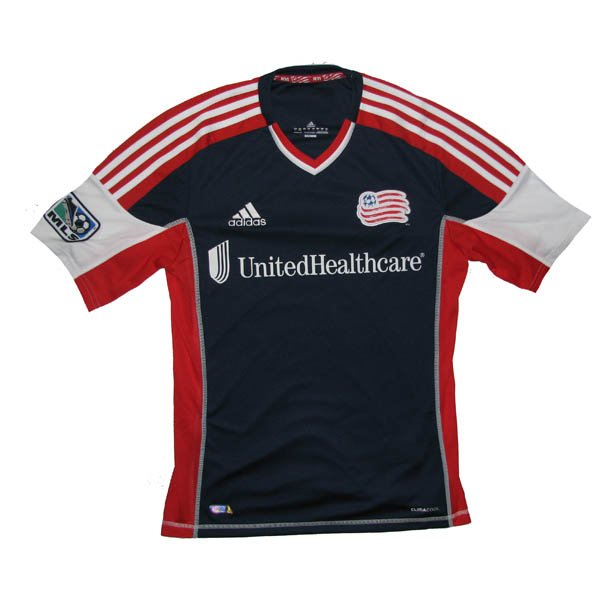
Home
I’m too drunk and bored I can’t be bothered to comment other than there’s 3 colors in the v-neck!!!!  The only thing that could make this kit worse is a boring, white-guy, suburbanite sponsor…oops there it is – "United Healthcare".  At least the flag of New England redeems the back of the shirt.
Kit = Bud Light Lime
Sponsor = Zima

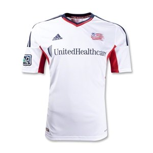
Away
Worse than the home kit.  Makes me want to write an angry letter to the Revs front-office.  How far you’ve come from the garish, AMERICA-FUCK-YEAH shirts from yesteryear. 
Kit = Zima
Sponsor = Zima


New York Red Bulls
Home
Unlike last year’s patch-work design, this years is the Revs kit with less color.  For some reason it doesn’t bother me AS much as the Revs, but I’m still pretty pissed if I’m an NYRB fan who bought last year’s shirt – might as well buy a white t-shirt and screen print your own crest and sponsor onto it.
Kit = Bud Light Lime
Sponsor = Bud Light Lime – the logo is way too big for the shirt and it duplicates design elements from the crest.  Snore.

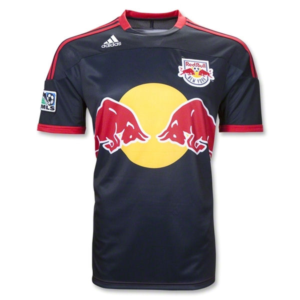
Away
No change from last year’s almost, but not quite as patch-work-y home shirt.  The Navy blue is redeeming but the sponsor and adidas’s fascination with their three stripes impedes me from liking this one too much.
Kit = Miller Lite
Sponsor = Bud Light Lime


Philadelphia Union
Home
So the last two years, the Union have had a weird Star Trek: The Next Generation thing going on.  This year they change it up a bit with a more modern interpretation on the solid center-swath of color.  The baby blue trim interspersed with the navy base is a nice touch as is the Gold PSG/Center-swath of color.  The authentic shirt has a “far-east” style collar that isn’t replicated on the replica shirt (come on adidas, make them one in the same already and quite with your pricing BS) which I haven’t decided on as of yet.
Kit = Sam Adams
Sponsor = Miller Lite – To have to explain this to every woman you encounter gives you an opportunity to grow the sport.("Bimbo? No... Beeembo.")  To have to explain this to every woman you encounter makes you wish they had something more degrading, but at least respectable, like an escort service on the front of their shirts.

Away
Same template, but different colors (in a way that’s vastly different from the Montreal Impact).  Not sure yet what my thoughts are on that blue being the basis of the jersey, but it continues to pique my interest and it might eventually really grow on me.
Kit = New Glarus Moon Man
Sponsor = Miller Lite


Toronto FC
Home
TFC keeps their Home kit from the previous season which is an Arsenal/West Ham/Aston Villa-esque shirt with a base of one color and sleeves of a different color.  There’s nothing remarkable about this shirt but the graphite sleeves draw me in.
Kit = Sam Adams
Sponsor = Miller Lite – we’ve seen this before but in two colors instead of one.

Away
TFC also keeps their Away kit from the previous season, which is very similar to the new Crew Home shirt, except it’s not yellow. And it doesn't have the weird cross-breast tri-color barf-fest. The graphite collar on the white shirt gives this shirt an element of class not seen in other collared shirts adidas has put forth for Eastern Conference MLS foes.
Kit = Sam Adams….almost a Moon Man
Sponsor = Miller Lite


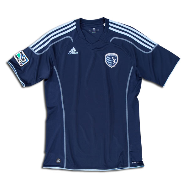
Sporting Kansas City
Home
Oh adidas and Sporting KC, how you missed the boat with this one.  The new crest and ideology behind the club’s name is great.  However, the kit having a seam mimicking the crest without a color differentiation (however slight) is a big mistake.  Without a color differentiation, the seam representing the border between Kansas and Missouri is unfathomable unless you inappropriately invade the shirt wearer’s personal space.  You’re so close to being above average, but just not enough nuance on this to make it a great kit.  Hurts to think that a shade or two darker on one side of the kit takes you from being toasted with a Sammy to a Surly Abrasive, doesn’t it?
Kit = Sam Adams…almost a Surly Abrasive
Sponsor = N/A

Away
Similar to Montreal with opposite colors on the same template, but this one is classier in its subtlety.  I still wish there was color variation between the Kansas and Missouri portions of the shirt.
Kit = Sam Adams…almost a Surly Abrasive
Sponsor = N/A

Get the NEW Free Beer Movement "Pint Glass" shirt! Only from Objectivo.com