Showing posts with label DrinkWear. Show all posts

Thursday, March 15, 2012

DrinkWear - Bumpy Pitch "Tavern Tee"

1 comments
Why spend you hard-earned money on green beer this St. Patrick's Day when you can have something waaay more epic and long-lasting. Bumpy Pitch, the California-based soccer lifestyle brand, has dropped another limited edition shirt for the upcoming "drinking holiday". But it's much more than that.
"One of the greatest things about the experience of owning a business is the experiences that you get to have along the way. Luckily for us, the Bumpy Pitch and The Original Winger is a crew of friends that is about much more than what we do as a company. We’ve all been friends for years and we all hold each other down in business and in life. We’re greater than the sum of our parts. 
To celebrate all that that night represented, and the journey, we proudly present the Bumpy Pitch Tavern tee. The inspiration is clearly taken from that St. Patrick’s Day, but it’s also inspired by the idea of celebrating life with your folks. It’s a hectic world we all have to deal with, and sometimes you just gotta stop and enjoy the moment. Speaking of that night, here is a very small slice of what went down…"
Inspired by the look of a pint of Guinness with their own BP twist this shirt is available for just a short time. Be the envy of all your drinking buddies and snag this one first and the call "dibs" on wearing it Saturday night.


Get the NEW Free Beer Movement "Pint Glass" shirt! Only from Objectivo.com

Friday, March 9, 2012

DrinkWear - Beer Rags? FBM's 2012 MLS Eastern Conference Kit Preview

11 comments


By Nick Sindt / Senior Shirt Correspondent

With the MLS season about to dawn, we at the Free Beer Movement thought we’d sit down and evaluate this season’s offerings for those who are unabashed kit-nerds like us.  Hey it’s part of the US Soccer culture, right?

(I will do my damndest to refrain from lambasting the ALL ADIDAS ALL THE TIME motif in MLS.  In truth that contract is great for the league, and thus the American game in general, but I’ve been drinking whilst composing this so I make no promises.)

To rate all of the kits (new and last year’s offerings that will be kept due to the two-year agreement between MLS and adidas) I will be making suggestions on what type of beer to toast each kit and its sponsor with:

Lowest of the Low = Macro-Brewers who produce flavored beers to be represented by Bud Light Lime.  You’re on thin ice; one step away from being toasted with two 40oz-ers of Zima.  Heretofore referred to as Bud Light Lime.

Below Average = Macro Brews like Miller Lite and Bud Light.  You have your place and time, and I appreciate everything you did for me in college, but really it’s time to add some depth, nuance (Lime is not a nuance), and maturity to yourself just like I purport to have done.  Heretofore referred to as Miller Lite.

Average = Macro-Micro Brews like Same Adams, Leinenkugels, etc.  You’re pretty widely distributed because you’re easy on most palates but restaurants still up-charge you as if you’re a Micro-brew simply because you’re not Miller or Bud.  Heretofore referred to as Sam Adams.

Above Average = Micro/Craft Breweries.  Pick your favorite local small-time brewer’s year-round offerings and toast the kit designers for a job well done with your go-to grown-up beer.  Heretofore referred to as New Glarus Moon Man.

Best of the Best = Seasonal Micro/Craft Brews that you wait all year long for and are willing to shell out the extra scratch for.  It’s so good it’s worth it, so raise a glass with your best can/bottle/glass of suds because even if it’s not your team this is a classy shirt and deserves its due.  Heretofore referred to as Surly Abrasive. 

Eastern Conference


Chicago Fire
Home
Much improved effort on past years.  The blue swath across the chest in place of the white makes this look a lot less rec-league – think about it every rec-league style kit template that all manufacturers put out is <Some Color> and White.  The collar is a nice touch of class for an organization that is near and dear to my heart.  The only downside is adidas continuing to kick us in the teeth with their three stripes down the sleeves and the sponsor; I’m happy Quaker is getting involved in the game and working to fight childhood obesity, but the quaker face and name does not inspire.
Kit = New Glarus Moon Man (but only just barely or barley, as it were)
Sponsor = Bud Light Lime

Away
Wow, if the home kit is much improved over past years, this is an SAT analogy where iPod : Record :: Chicago Fire 2012 Away Kit : X!!!!  Hint: Burlap sack is the front-runner in a Gallup Poll, just ahead of Mitt Romney for the GOP nomination…I digress.

The navy shirt, as opposed to plain old white with some home color trim is miles ahead.  Adding the horizontal Carolina Blue pin-striping broken up by the four six-pointed stars takes this to a whole new level.  Sure you can find fault with the sponsor and the number of times the “Chicago” stars are found on the shirt (it is a touch “heavy-handed” in cooking terms), but overall this is a class shirt and I might have to take some money out of my daughter’s college fund to buy this thing.  Well done adidas!
Kit = Surly Abrasive
Sponsor = Sam Adams


Columbus Crew
Home
Columbus’s home shirt is YELLOW with some black trim, we get it.  2012’s edition is a decent enough shirt with a collar to make it suitable for wearing out and about or to the golf course.  Is it different from last year's?  Yes, but who amongst you that isn’t a die-hard Crew fan would know that?  Not many.  Columbus’s new sponsor is a bit of a detractor as it takes away from the overall look and presentation of it all.
Kit = Miller Lite
Sponsor = Bud Light Lime

Away
As with Chicago’s Away Kit, Columbus’s is simply a wow all on its own.  Adidas, I get what you’re trying to do here (throwback to the original MLS Crew shirt without being an exact match), I really do, but this is a miss/defect/travashammocery of Shakesperean proportions.  Why do the Black and Yellow horizontal bars stop right above Chad Marshall’s nipples?  I mean Sofia Vergara could ‘make it work’ but the beer swilling inhabitants of Crew Stadium…not so much.  What happened to mostly black with some yellow trim?  That kit would at least make me look trim.
Kit = Bud Light Lime
Sponsor = Bud Light Lime


DC United
Home
Glory Be!!!!  There’s Red in them thar shirts.  For the first time in a long time, DC United’s other color, red, gets to play more than a passing role in their home shirts.  Not a fan of the weird neck/collar spikes, the bicep cuffs of color, but at least it’s not Black with White.  The VW sponsorship not only adds to the shirt but it’s nice to have a major auto maker on the MLS’s side.
Kit = Miller Lite
Sponsor = Sam Adams

Away
It seems the theme for MLS clubs this year is to have a collar on at least one of the shirts.  DC Unite obliges on their away kit, which has a nice red collar on a white shirt.  For some reason this one bugs me but I can’t pinpoint why.  The bicep cuffs and pit-stain trim are red and stand out nicely.  Even the concussion I received from three stripes on the arm doesn’t bother me as bad with this shirt.  Maybe it’s the complete package…Though, again it’s better than just White with Black.
Kit = Miller Lite
Sponsor = Sam Adams

Third
Utilizing 2011’s 3rd Kit, ALL RED with some black will return for cup competitions.  Not a horrible offering, but with red shorts and socks it becomes a bit of an eyesore.  What is it with DC and adidas that makes them stray from the original template of black shirt & socks or white shirt & socks with red shorts?
Kit = Miller Lite
Sponsor = Sam Adams


Houston Dynamo
Home
Houston retains the same kits from last season, which have a weird sunburst/Azteca sublimation that I’m not quite getting right now, but it looks decent.  Other than the tangerine orange base the only thing this shirt has going on is the adidas trademark three-stripes (we get it already…), a white collar, and the sponsor logo: greenstar, whomever that is.  Though I’m not getting the sublimated pattern, the simplicity of this kit is nice.  Solid effort when paired with White shorts, in opposition to the solid colored shirt/shorts/socks combo most teams trot out.  Plus it doubles as a golf shirt.
Kit = New Glarus Moon Man
Sponsor = Miller Lite

Away
Almost the exact opposite of the home kit, though the sublimated pattern is much more subtle if it’s even there at all…
Kit = New Glarus Moon Man
Sponsor = Miller Lite

Montreal Impact
Home
For the newest entrant into the parity that is MLS, adidas broke out a stop or two.  To be honest I haven’t seen this template, yet, but I (and you) probably will on every team adidas outfits throughout Europe, Asia, and the US at some point in the next year or so.  Adidas did touch it up with a full-body cross made of fleur-de-lises, of which only the fleur-de-lises represent the city of Montreal.  This touch puts it above the offering for Vancouver last term, but well, well below Portland’s kits from their inaugural year.
Kit = Sam Adams
Sponsor = Miller Lite – thankfully someone else sponsors the Vancouver Canucks Whitecaps

Away
Holy Hell!!! Adidas has gone radical with the Away shirt for the new boys; opposite colors from the home shirt on the same template. 
Kit = Bud Light Lime
Sponsor = Miller Lite – it adds that splash of red that you need ‘round February in the Great White North, whether you’ve put your neighbor through a wood chipper or slit your own wrists…

New England Revolution
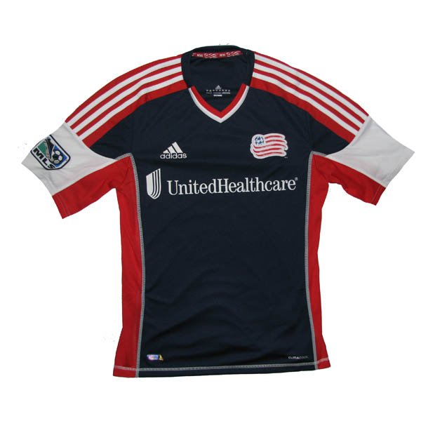
Home
I’m too drunk and bored I can’t be bothered to comment other than there’s 3 colors in the v-neck!!!!  The only thing that could make this kit worse is a boring, white-guy, suburbanite sponsor…oops there it is – "United Healthcare".  At least the flag of New England redeems the back of the shirt.
Kit = Bud Light Lime
Sponsor = Zima

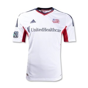
Away
Worse than the home kit.  Makes me want to write an angry letter to the Revs front-office.  How far you’ve come from the garish, AMERICA-FUCK-YEAH shirts from yesteryear. 
Kit = Zima
Sponsor = Zima


New York Red Bulls
Home
Unlike last year’s patch-work design, this years is the Revs kit with less color.  For some reason it doesn’t bother me AS much as the Revs, but I’m still pretty pissed if I’m an NYRB fan who bought last year’s shirt – might as well buy a white t-shirt and screen print your own crest and sponsor onto it.
Kit = Bud Light Lime
Sponsor = Bud Light Lime – the logo is way too big for the shirt and it duplicates design elements from the crest.  Snore.

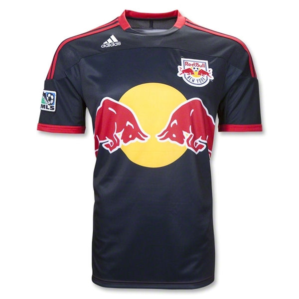
Away
No change from last year’s almost, but not quite as patch-work-y home shirt.  The Navy blue is redeeming but the sponsor and adidas’s fascination with their three stripes impedes me from liking this one too much.
Kit = Miller Lite
Sponsor = Bud Light Lime


Philadelphia Union
Home
So the last two years, the Union have had a weird Star Trek: The Next Generation thing going on.  This year they change it up a bit with a more modern interpretation on the solid center-swath of color.  The baby blue trim interspersed with the navy base is a nice touch as is the Gold PSG/Center-swath of color.  The authentic shirt has a “far-east” style collar that isn’t replicated on the replica shirt (come on adidas, make them one in the same already and quite with your pricing BS) which I haven’t decided on as of yet.
Kit = Sam Adams
Sponsor = Miller Lite – To have to explain this to every woman you encounter gives you an opportunity to grow the sport.("Bimbo? No... Beeembo.")  To have to explain this to every woman you encounter makes you wish they had something more degrading, but at least respectable, like an escort service on the front of their shirts.

Away
Same template, but different colors (in a way that’s vastly different from the Montreal Impact).  Not sure yet what my thoughts are on that blue being the basis of the jersey, but it continues to pique my interest and it might eventually really grow on me.
Kit = New Glarus Moon Man
Sponsor = Miller Lite


Toronto FC
Home
TFC keeps their Home kit from the previous season which is an Arsenal/West Ham/Aston Villa-esque shirt with a base of one color and sleeves of a different color.  There’s nothing remarkable about this shirt but the graphite sleeves draw me in.
Kit = Sam Adams
Sponsor = Miller Lite – we’ve seen this before but in two colors instead of one.

Away
TFC also keeps their Away kit from the previous season, which is very similar to the new Crew Home shirt, except it’s not yellow. And it doesn't have the weird cross-breast tri-color barf-fest. The graphite collar on the white shirt gives this shirt an element of class not seen in other collared shirts adidas has put forth for Eastern Conference MLS foes.
Kit = Sam Adams….almost a Moon Man
Sponsor = Miller Lite


Sporting Kansas City
Home
Oh adidas and Sporting KC, how you missed the boat with this one.  The new crest and ideology behind the club’s name is great.  However, the kit having a seam mimicking the crest without a color differentiation (however slight) is a big mistake.  Without a color differentiation, the seam representing the border between Kansas and Missouri is unfathomable unless you inappropriately invade the shirt wearer’s personal space.  You’re so close to being above average, but just not enough nuance on this to make it a great kit.  Hurts to think that a shade or two darker on one side of the kit takes you from being toasted with a Sammy to a Surly Abrasive, doesn’t it?
Kit = Sam Adams…almost a Surly Abrasive
Sponsor = N/A

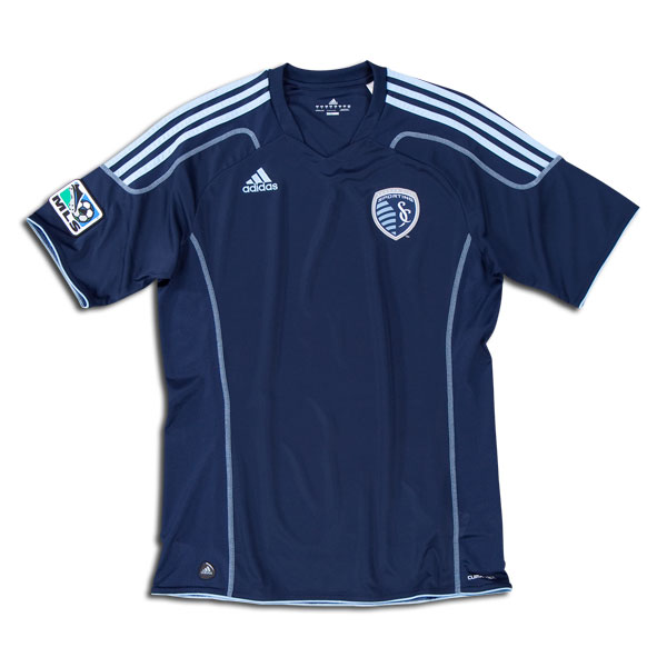
Away
Similar to Montreal with opposite colors on the same template, but this one is classier in its subtlety.  I still wish there was color variation between the Kansas and Missouri portions of the shirt.
Kit = Sam Adams…almost a Surly Abrasive
Sponsor = N/A

Get the NEW Free Beer Movement "Pint Glass" shirt! Only from Objectivo.com

Wednesday, August 17, 2011

FBM DrinkWear - Live Breathe Futbol's "No Work, Just Play" Shirt

0 comments

Our friends at Live Breathe Futbol keep on cranking out the cool gear. With the summer winding down it's easy to think that the fun is all over. Good thing LBF has made a shirt (and video) to remind us that we should always be at play.

Check out our interview from a few months back with LBF's bossman and creative genius, Ebun.


Get the NEW Free Beer Movement "Pint Glass" shirt! Only from Objectivo.com

Friday, July 15, 2011

FBM DrinkWear - Umbro's "Cosmos For A Blackout"

1 comments

On July 13, Brazilian Carlos Alberto Torres arrived in New York City in the midst of a blackout. Not just any blackout, but the infamous 1977 blackout that was marked by extreme violence and looting in the Big Apple. Quite the warm welcome for Pele's former teammate at Santos FC, a member of the 1970 World Cup winning side, and widely regarded as one of the games best defenders. His goal in the 1970 Cup Final is often named "the greatest ever World Cup goal".

Torres had come to NYC to join Pele again, and other international greats Giorgio Chinalgli, and Franz Beckenbauer, to play for the Cosmos. This trifecta of soccer greats would help lead the Cosmos to the 1977 Soccer Bowl and etch their names, and the club, into American soccer history.

While the Cosmos may or may not become Major League Soccer's twentieth (or later) franchise, the club has wasted little time since it's resurrection in August 2010. Pele was named honorary president at the team's re-launch, Eric Cantona was brought on a "Director of Soccer" and former USMNTer Cobi Jones as his deputy.

Lastly, New York Cosmos branded merchandise has been rolling out faster than their press releases.

Their latest line of Cosmos-wear is designed by Umbro and was inspired by Alberto Torres arrival in New York City during the 1977 blackout called, "Cosmos for a Blackout".

A cool video from Umbro with Carlos Alberto Torres telling the story of his arrival on the day of the blackout:


Umbro Blackout from Buck on Vimeo.

Get the NEW Free Beer Movement "Pint Glass" shirt! Only from Objectivo.com

Thursday, July 14, 2011

FBM DrinkWear - Nike USWNT Mosaic Shirt

15 comments


Greek designer Charis Tsevis teamed up with the Nike Graphic Design studio in Oregon to create this mosaic t-shirt for the USWNT's participation in the 2011 Women's World Cup in Germany.

Both are about as hot as can be right now.

Tsevis made a moasic bald eagle out of design elements from the US Soccer Federation and the shirt is available in three colors: red, blue, and purple.

Here's the whole image:


And a close up:


You can buy the tees here and here and many other places.


Found on Behance.net


Get the NEW Free Beer Movement "Pint Glass" shirt! Only from Objectivo.com

Thursday, June 30, 2011

FBM DrinkWear: Live Breathe Futbol

6 comments

As soccer in America grows so does the call for quality, stylish lifestyle apparel. We've all got our jerseys, scarves, and team specific Snuggies, but those have their time and place limitations. Thankfully soccer fans have great options with companies like Bumpy Pitch and Objectivo (maker of the FBM shirt!).


But there's a new kid on the block and he's a design machine. Introducing Ebun Olaloye and his brand, "Live Breathe Futbol", who's name implies that his shirts are for soccer fans both on and off the pitch; for those who's obsession with the game is a lifestyle choice. Olaloye makes shirts that work in game at at the bars.


We were lucky enough to get a few shirts from LBF and can attest to their comfort and style. Ebun was also gracious enough to answer a bunch of questions about where LBF came from, his thought process behind each shirt, and what's next for the company.


Read on....

Ebun
Free Beer Movement: Tell me a little about yourself. Who are you? Your background in design? Your background in your love of soccer?


Live Breathe Futbol: My name is Ebun and I’m a 21 year old architecture student at Temple University in Philadelphia. My obsession with design started when I was a child. I drew on the walls of my parent’s living room and on any blank surface I could find. In the 9th grade a friend saw my sketch of a t-shirt and asked me to make it for him. Since then I became obsessed with designing t-shirts and my sophomore year I made a new t-shirt every day to wear to school.

My love of soccer started in Nigeria where I was born. I grew up watching the Super Eagles and playing soccer with my friends during recess at school. I quickly became obsessed to the point where I’d disobey my father and stay out on the field much longer than I was allowed to. I always got in trouble for it, but to me getting to play for an extra hour or two was worth the reprimand.

FBM:Where did LBF come from? Why did you start it? How did it start?

The shirt that started it all.
LBF: My sophomore year in college I painted a t-shirt with Cristiano Ronaldo on it. It was bold, unrefined and unlike anything I’d ever seen. I got tons of complements on the shirt even from people who had no idea who he was. And shortly after I made a shirt with Kaka hoisting the Ballon d’Or trophy the year he won it. LBF still didn’t exist at this point; I was just painting shirts with my favorite players on them. One day, I was in class and drew a t-shirt in my sketchbook that had the words “Live Breathe Futbol” on it. I thought it sounded cool and got two dozen shirts printed up. All my friends at pick up soccer bought the shirts within a few days. At that point I hadn’t decided on a name for the brand, but ended up sticking with “Live Breathe Futbol” because there is no question about what it means; it is as direct as can be. If you see anyone wearing a shirt that says Live Breathe Futbol, you immediately know what their life is like.

I started LBF as a response to a fascinating phenomenon I witnessed firsthand at Temple University and other surrounding colleges. Everywhere my friends and I went to play there were a group of guys from all over the world who were playing soccer daily just because they loved the game. The conversations on the sidelines were all about soccer as well, so LBF is my way of championing this soccer-driven lifestyle that so many people across the world live.

FBM: What is the philosophy/beliefs behind LBF?

LBF: LBF operates under two core beliefs, with one relating to design and the other to futbol. LBF’s design philosophy is that a sport as beautiful and colorful as soccer needs a brand that provides fans with beautiful, well-designed gear that is culturally relevant to the sport. I haven’t seen a brand that makes soccer apparel that gets me super excited. My goal is to make LBF that brand for people. I want to design shirts that make people go absolutely nuts the same way they do when they see an amazing goal.

LBF’s futbol philosophy is sort of split into two parts. The first part has to do with the divisiveness of futbol as a sport. As an Arsenal fan, I am morally obligated to dislike Tottenham, etc… However, I feel the same joy as a Spurs fan when our teams win, and the same agony when our teams lose. My goal is to unite futbol fans based on our collective love and passion for the game. The second part of the philosophy has to do with championing the futbol players who play for the love of the game. My friends and I have never earned a dime from playing futbol, yet we’ve spent hundreds of dollars on league fees and driven hundreds of miles just to play futbol. I think it’s time that amateur players get some shine.

FBM: Inside each of your shirts reads, “This garment is designed with the history, character, and flair of the beautiful game in mind. Wear with pride. Remember it’s about moments.” Tell me what that means to you and what it means to the wearer of your shirts.

LBF: When I started LBF I wanted to make each piece mean something to the person who ends up wearing the shirt. The reason for printing the quote on the inside of the shirt is to remind the wearer that LBF isn’t just a brand that’s making cool t-shirts. Each design begins somewhere real, whether it’s a momentous game, a legendary player, or an emotion that resonates with every supporter. That way, you’re wearing something with a bit of history and character. Some people buy things based solely on aesthetics, and others buy for sentimental reasons. I just wanted to ensure that regardless of why you buy an LBF shirt you remember the moments that inspired its creation.

FBM: You recently won a contest with one of your shirt designs for the Philadelphia Union? Tell me about that.


LBF: Winning the Philadelphia Union‘s contest was immense for both LBF and me as young designer. My good friend, Jeff, sent me the link to the contest. I am not a huge fan of design contests because the talent out there is so amazing that it can be discouraging to even try at all. However, at the time of the contest I was in a mindset where I wanted to really challenge myself as a designer and see how I fared in comparison to other designers.

My goal with the Union contest was to create something that was culturally relevant to both Philadelphia as a city and the Union as a new part of the city’s sports identity. After a few iterations in my sketchbook, I decided that a hand drawn design was the best approach to capturing the classic and iconic look that best describes Philadelphia. Fortunately, the design resonated with people enough to make it the winner. I got the chance to stand on the field at PPL Park in front of 19,000 people. It was very special, too, because I got to share the moment with my friends.

FBM: How can fashion influence American soccer culture? What part does it play in American soccer culture?

I think fashion can influence American soccer culture if iconic American brands like Ralph Lauren and Tommy Hilfiger embrace American soccer and promote the game with their clothing. By doing this, they expose people who never watched a game of soccer to the wonderful sport the same way Ralph Lauren did with his POLO line.

LBF Spring Fashion Show
Fashion’s role in American soccer culture can be looked at from two angles. The first is on the scale of the national team. American pride is on display at stadiums with flags waving and countless U.S. jerseys with “Donovan” and “Dempsey” written across the backs. However, this is a bit problematic because Nike wins in all of this. American soccer simply needs more fashion brands creating gear that people can wear in support of the national team. I honestly get a bit tired of seeing the same jerseys over and over again. A cool t-shirt is more versatile and more stylish than a jersey.

Fashion also shows the diversity in American soccer culture. I know a ton of guys who wear jerseys from countries they aren’t from just to show their support for or admiration of players from those countries. It is really inspiring to see how diverse American soccer fans are. I imagine this doesn’t happen in many other places in the world.

FBM: What’s upcoming for LBF? Any hints to the summer line?

LBF: There’s quite a lot upcoming for LBF. So far the brand has been run entirely by me, and in order to take it to the next level, I’ve teamed up with a good friend of mine who’s also soccer crazy to get things going. We also started an inter-collegiate league that features 24 universities in the tri-state area (NJ, DE, PA) called the Live Breathe Futbol Premier League. We will also launch a new website that’s pretty cool along with the summer line.

The summer line is going to be very relaxed. A lot of the pieces are understated and a departure from the graphically intense designs that the brand is known for. Summer is about kicking back, relaxing with your friends and not having a care in the world. The shirts will reflect that without losing the essence of living and breathing futbol.


 Check out Live Breathe Futbol for these and more awesome shirts!

Get the NEW Free Beer Movement "Pint Glass" shirt! Only from Objectivo.com

Thursday, June 2, 2011

FBM DrinkWear: Nike/American Outlaws Collaboration T-Shirt

0 comments


If you're going to be in Foxboro for the U.S. Men's National Team game against Spain AND a member of the U.S. supporters group, American Outlaws, you are in for a pretty sweet treat.

In addition to another victory over the defending World Cup champions, every AO member is going to pick up one of these awesome Nike/AO collaboration shirts to to help pain Gillette Stadium red for the afternoon's match (too bad that's also the main color of Spain's jersey, but whatever.. make it easier, really.).

From Nike:
"First a kit inspired by supporters. Then a team motto, Indivisible, written by the fans and emblazoned on the jersey sleeve. Now Nike joins forces with Studio Number One, a creative agency founded by world-famous street artist Shepard Fairey to create a series of limited edition t-shirts to again pay homage to the supporters and tie us to the Gold Cup as one:
One nation Indivisible.
Inspired by vintage Americana, liberty, justice, and military/street art, the T-shirts will be given away to all American Outlaw members on matchday June 4 in Foxboro, MA. With the Gold Cup approaching, it’s time now more than ever to band together as one, indivisible.
It’s more than just 11 players on the pitch. It’s coaches, families, friends, and fans. It’s you. Only the divided shall fall. All the way to the Gold Cup final on June 25, We Are Indivisible."
Sorry if you not heading up to the birthplace of American freedom, but AO has mentioned that this is only the first and definitely not the last collab we'll see from them and the Beaverton boys.

Gold Cup, perhaps?

Get the NEW Free Beer Movement "Pint Glass" shirt! Only from Objectivo.com

Thursday, February 3, 2011

FBM DrinkWear - "I Like That Boon Boo Tee"

0 comments


Welcome to a new feature on the Free Beer Movement called "DrinkWear". We started this series because promoting soccer in American is a full-time job (just not for us yet) and you need the wardrobe to do so. The "jersey" look isn't going to work every time. DrinkWear promises (fingers crossed behind our backs) to be a great resource to outfit your soccer style on and off the field.

You're probably wondering what took so long, but both quality and genius take time.

Wait no longer! Sporting KC and their supporters group, The Cauldron, have released their "Boon Boo Ree" shirt.

If you're a fan of creative espanol commentary in T-shirt form then you should definitely pick up one of these Teal Bunbury shirts. For just 20 bones you, too, can own a piece of American soccer pop culture that will last long past (hopefully) the careers of the Black Eyed Peas and the song that inspired:


You've got two pretty rad (yes, we used "rad") designs to pick from. We're partial to the light blue one, but mostly because it really makes our eyes sparkle.

You can place your order through next Wednesday, February 9th. Do it. Now.

Editor's Note: We've taken notice that we've run several Sporting KC articles on the site lately. We're nearly done spending the briefcase of money they gave us to make them look good so we'll be back to repping all the other teams soon, too.


Photo Credit: Sporting KC

Support the Movement. Get the Free Beer Movement T-Shirt. Only from Objectivo.com