Showing posts with label Nick Sindt. Show all posts

Thursday, June 10, 2010

Beer-tastic Word Cup Jerseys: Group H

2 comments
By Nick Sindt

Here we are! UNDER ONE DAY (holy shit!?!?!?) to the greatest sporting spectacle the world has ever seen. No... not the monster truck rally at your local convention center. The World Cup! The pageantry, the globe's greatest teams and players, the crazed and delusional fans (looking at you, England).

But what about the team's jerseys? Every four years, and sometimes even more frequently, the National teams of nearly every country roll out new threads for materialistic consumers to salivate over and spend their hard earned dollars, yen, Euros, etc on.

How will you ever sort through all of them to decide which jersey you'll treasure for the next month?

Worry no more! The Free Beer Movement's Nick Sindt is going to walk you through all 32 teams' home and away jerseys and rate them based on (what else?) beer!

Previous Groups:
Group A
Group B
Group C
Group D
Group E
Group F
Group G

Here’s how the ratings will work; I’ll be ranking each kit on its design/uniqueness and purchasability (from a home fan’s standpoint) and the rankings will of course be done in beers as follows:

- John Smith’s Extra Smooth = An Excellent design that deserves to be toasted with a fine beer; you don’t need to pound these back to look at it, but it’s beer and it’s the World Cup so we know you’re going to.

- Summit [Insert Local Brewery Name Here] Extra Pale Ale = A solid design though it may not satisfy everyone’s pallets. You’ll only need two or three of these excellent brews before you lose your inhibitions and purchase the kit online in the middle of the night.

- Miller Lite = A shallow and pedantic effort by one of the “big names” in the world, but it’s still an average beer/your national team’s kit so you can’t hate it, right?

- Coors Lite = Thankfully Coors tastes and goes down like water because you’ll be drinking a lot of it to drown out the abomination that is this iteration of your team’s kit.

- Bartles & Jaymes = Shennaigannery! Travashammockery! This kit is such an abomination you’d rather punish your liver, taste buds, and stomach with many a wine cooler.

Group H

Spain Home --------------------------- Spain Away


Adidas completely crapped the bed with Spain’s kit this time around. The Confederations Cup shirt was pretty sweet with a nice dark red with navy blue and gold trim, this year’s World Cup shirt looks so outdated that I’m surprised it doesn’t come with its own onomatopoeia comic dialogue bubbles. Though we shouldn’t be surprised given adidas’s current ad campaign.

Home Design = Bartles & Jaymes
Home Uniqueness = Bartles & Jaymes
Home Purchasability = Bartles & Jaymes

The away shirt for Spain is at least a decent color, but it’s still a pretty pedestrian template and effort.

Away Design = Coors Lite
Away Uniqueness = Coors Lite
Away Purchasability = Coors Lite


Switzerland Home----------------------------- Switzerland Away


Whether it’s because the Swiss are “neutral” non-fighters or because the Swiss FA requested not to look like doorknobs, their jerseys for this World Cup are the same as the Italian template except without the muscle-man chest spray painted on like some bad t-shirt at the state fair. The only downside of the away shirt (which is the exact inverse of the home) is that Puma has gone sans collar meaning that it’s only acceptable at the municipal golf courses and not the ritzy country clubs in your home town.

Home and Away Design = Miller Lite
Home and Away Uniqueness = Coors Lite
Home and Away Purchasability = Miller Lite

Honduras Home ----------------------------- Honduras Away

For the Honduras home kit this year, it looks like the Joma designers were a little confused; do they make it all blue, do they make it blue fading to white, or blue and white vertical stripes? Apparently unable to rock, paper, scissors or flip a coin, they decided to go with all three designs, which actually doesn’t look too bad, especially given the direction Nike took with next year’s Inter Milan home shirt…Rocking one of these shirts during the summer will earn you instant cool points with soccer hipsters, if you’re into that sort of thing.

Home Design = Summit EPA
Home Uniqueness = John Smith’s Extra Smooth
Home Purchasability = Summit EPA

The away shirt is a little boring with only the blue fade to white band across the upper chest holding over from the home design. Otherwise it’s a plain white t-shirt with some blue trim, like Greece.

Away Design = Coors Lite
Away Uniqueness = Miller Lite
Away Purchasability = Miller Lite

Chile Home ------------------------ Chile Away


A simple red shirt for Chile can only be spiced up by sexy Chilean models, which is exactly what their FA did to launch the kit. Looking at it without the sexy models not only saddens, but bores me as well.

Home Design = Coors Lite
Home Uniqueness = Coors Lite
Home Purchasability = Coors Lite

Not even sexy models can spice this bland offering up.

Home Design = Bartles & Jaymes
Home Uniqueness = Bartles & Jaymes
Home Purchasability = Bartles & Jaymes

We're done.... on to the World Cup!

Bookmark and ShareSupport the Movement. Get the Free Beer Movement T-Shirt. Only from Objectivo.com

Wednesday, June 9, 2010

Beer-tastic World Cup Jerseys: Group G

0 comments
By Nick Sindt

Here we are! Under just two days to the greatest sporting spectacle the world has ever seen. No... not the monster truck rally at your local convention center. The World Cup! The pageantry, the globe's greatest teams and players, the crazed and delusional fans (looking at you, England).

But what about the team's jerseys? Every four years, and sometimes even more frequently, the National teams of nearly every country roll out new threads for materialistic consumers to salivate over and spend their hard earned dollars, yen, Euros, etc on.

How will you ever sort through all of them to decide which jersey you'll treasure for the next month?

Worry no more! The Free Beer Movement's Nick Sindt is going to walk you through all 32 teams' home and away jerseys and rate them based on (what else?) beer!

Previous Groups:
Group A
Group B
Group C
Group D
Group E
Group F

Here’s how the ratings will work; I’ll be ranking each kit on its design/uniqueness and purchasability (from a home fan’s standpoint) and the rankings will of course be done in beers as follows:

John Smith’s Extra Smooth = An Excellent design that deserves to be toasted with a fine beer; you don’t need to pound these back to look at it, but it’s beer and it’s the World Cup so we know you’re going to.

Summit [Insert Local Brewery Name Here] Extra Pale Ale = A solid design though it may not satisfy everyone’s pallets. You’ll only need two or three of these excellent brews before you lose your inhibitions and purchase the kit online in the middle of the night.

Miller Lite = A shallow and pedantic effort by one of the “big names” in the world, but it’s still an average beer/your national team’s kit so you can’t hate it, right?

Coors Lite = Thankfully Coors tastes and goes down like water because you’ll be drinking a lot of it to drown out the abomination that is this iteration of your team’s kit.

Bartles & Jaymes = Shennaigannery! Travashammockery! This kit is such an abomination you’d rather punish your liver, taste buds, and stomach with a wine cooler.

Group G

Brazil Home ------------------------------- Brazil Away


There’s not much Nike can do with the Brazil home kit without the purists being up in arms so there’s not much to say about this one. I'm pretty sure that Brazil could pull the jerseys they sporting for their Nike airport commercial ("ahhhhhhhhhhh hidey hi oh oh") from the 1998 World Cup and no one would have noticed.

Home Design = Coors Lite
Home Uniqueness = Coors Lite

Home Purchasability = Miller Lite


Again, Brazil always wears blue for their away color, but this time Nike put a lot of little white dots on it. It’s a more unique offering than we usually get for a Brazil away shirt, but let’s be honest, they will wear the shirt in competition maybe once and no one is really going to buy it.

Away Design = Coors Lite
Away Uniqueness = Miller Lite

Away Purchasability = Coors Lite

North Korea Home --------------------------- North Korea Away


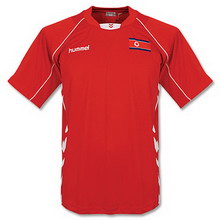
Maybe it’s because I was born during the cold war between the US and anyone who was supposedly communist, or maybe it’s because North Korea is communistic, but this kit just screams “commie.”

Home Design = Coors Lite
Home Uniqueness = Coors Lite

Home Purchasability = John Smith’s Extra Smooth (Kim Jong Il made me say it!)


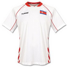
Honestly I was really holding out hope that the "away" kit would be this sweet tan that "Dear Leader" always has on, but alas, no.


Away Design = "Deigned and made in the Gaeseong Industrial Complex from the best of Korean labor"
Away Uniqueness = "Like a flower in the desert a unique beauty"
Away Purchasability = "Available in all DearLeader-Marts"


Cote D’Ivoire Home --------------------------- Cote D’Ivoire Away


I’ve grown tired of poking fun at Puma’s lack of originality.

Home Design = Coors Lite
Home Uniqueness = Coors Lite
Home Purchasability = Coors Lite


Puma’s ethnic portrayal of the African people is epitomized in their body-paint….I can’t keep that going with a straight face. At least the body paint stripey things are horizontal instead of vertical, and it looks like something a hip-hop anonymous artist from 1996 would wear.

Away Design = Coors Lite
Away Uniqueness = Coors Lite

Away Purchasability = Coors Lite


Portugal Home ---------------------- Portugal Away


It’s too bad that most of the Portuguese team is a bunch of d-bags, otherwise I’d give a solid endorsement of this kit. The stripe across the chest is unique, from all of the other Nike wearing squads, and looks decent with the white shorts (opposed to the solid maroon crayola look they’ve sported the last two years).

Home Design = Summit EPA
Home Uniqueness = Summit EPA

Home Purchasability = Coors Lite


Again, Portugal’s away shirt is another solid and unique offering from Nike, but I have to advise against buying it because of the associated douchebagginess that comes with it.

Away Design = Summit EPA
Away Uniqueness = Summit EPA
Away Purchasability = Coors Lite


Tomorrow..... the FINALE......Group H!

Bookmark and ShareSupport the Movement. Get the Free Beer Movement T-Shirt. Only from Objectivo.com

Tuesday, June 8, 2010

Beer-tastic World Cup Jerseys: Group F

1 comments
By Nick Sindt

Here we are! Under just three days to the greatest sporting spectacle the world has ever seen. No... not the monster truck rally at your local convention center. The World Cup! The pageantry, the globe's greatest teams and players, the crazed and delusional fans (looking at you, England).

But what about the team's jerseys? Every four years, and sometimes even more frequently, the National teams of nearly every country roll out new threads for materialistic consumers to salivate over and spend their hard earned dollars, yen, Euros, etc on.

How will you ever sort through all of them to decide which jersey you'll treasure for the next month?

Worry no more! The Free Beer Movement's Nick Sindt is going to walk you through all 32 teams' home and away jerseys and rate them based on (what else?) beer!

Previous Groups:
Group A
Group B
Group C
Group D
Group E

Here’s how the ratings will work; I’ll be ranking each kit on its design/uniqueness and purchasability (from a home fan’s standpoint) and the rankings will of course be done in beers as follows:

John Smith’s Extra Smooth = An Excellent design that deserves to be toasted with a fine beer; you don’t need to pound these back to look at it, but it’s beer and it’s the World Cup so we know you’re going to.

Summit [Insert Local Brewery Name Here] Extra Pale Ale = A solid design though it may not satisfy everyone’s pallets. You’ll only need two or three of these excellent brews before you lose your inhibitions and purchase the kit online in the middle of the night.

Miller Lite = A shallow and pedantic effort by one of the “big names” in the world, but it’s still an average beer/your national team’s kit so you can’t hate it, right?

Coors Lite = Thankfully Coors tastes and goes down like water because you’ll be drinking a lot of it to drown out the abomination that is this iteration of your team’s kit.

Bartles & Jaymes = Shennaigannery! Travashammockery! This kit is such an abomination you’d rather punish your liver, taste buds, and stomach with a wine cooler.
Since this World Cup is in South Africa we’ll start with the hosts.

Italy Home --------------------------Italy Away


Thankfully Puma will not be giving Italy one of their African template shirts with the country specific emblem sublimated on the shoulder. I’m having a difficult time trying to figure out what cultural icon they would put; maybe the leaning tower, the roman coliseum, a fat mafia guy, a big plate of spaghetti? There are just too many choices…As usual the home shirt for the Italians is a royal/azzuri blue color, but this year the collar has been spiffed up with a special 5-point opening with the green, white, and red lining of the Italian flag. And, there’s something else that I can’t quite put my finger on, is it the white trim on the shoulders, the newly added start to the crest, the FIFA cold crest for being the current World Cup holders, or could it be the weird Russel-Crowe-Gladiator-chiseled-chest pattern sublimated on the front of the shirt? What the hell is that about? It’s not like this is an overweight Sunday-league team running around trying to look fitter than they are, these are professional, and arrogant, athletes, did we really need to add something to make them appear more arrogant?

Home Design = Bartles & Jaymes
Home Uniqueness = Summit EPA
Home Purchasability = Bartles & Jaymes

The away kit wouldn’t be so bad if it weren’t for the god-awful Italian flag collar that appears when “popped,” which we know every Giuseppe Rossi wannabe in New Jersey will be sporting this summer making the jersey even less tolerable.

Away Design = Miller Lite
Away Uniqueness = Miller Lite

Away Purchasability = Coors Lite


Paraguay Home -------------------- Paraguay Away


Paraguay’s home shirt sticks with the traditional red and white vertical stripes, but adidas changed it up a bit thicker stripes. Not a bad effort, but not terribly awesome either.

Home Design = Miller Lite
Home Uniqueness = Miller Lite

Home Purchasability = Miller Lite


Even though their away kit is a lame adidas template, no one else at the cup (save North Korea since we don’t know what they’re going to be wearing) will be wearing them. The white with blue and red trim is a decent looking shirt.

Away Design = Miller Lite
Away Uniqueness = Summit EPA

Away Purchasability = Summit EPA


New Zealand Home-------------------------- New Zealand Away


Though extremely plain, there’s a subtle dignity to the All Whites wearing all white, though the grass stains are going to be a bitch. Something tells me that the NZ National Team also doesn't fill these things quite as well as their rugby counterparts, the All Blacks, do.

Home Design = Coors Lite
Home Uniqueness = Coors Lite

Home Purchasability = Miller Lite


Though the away shirt is the complete inverse of the home kit, an all black jersey/kit is pretty solid. The difficulty in wearing an all-black kit is that you're supposed to be the big, bad talented team from the Disney movies that walks over all of their opponents. I'm thinking that this isn't how it's going to pan out for the Kiwis.

Away Design = Coors Lite
Away Uniqueness = Coors Lite

Away Purchasability = Summit EPA


Slovakia Home --------------------------------- Slovakia Away


The guys and gals at adidas must’ve gotten tired by the time Slovakia’s turn for kit design. Their home and away offerings are almost as sad as what you’ll find on the local youth club teams. Poor, poor, poor effort by adidas.

Home and Away Design = Bartles & Jaymes
Home and Away Uniqueness = Bartles & Jaymes

Home and Away Purchasability = Bartles & Jaymes


Bookmark and ShareSupport the Movement. Get the Free Beer Movement T-Shirt. Only from Objectivo.com

Monday, June 7, 2010

Beer-tastic World Cup Jerseys: Group E

4 comments
(Editor's Note: Sorry for the lack of content today. We've been working on a bunch of stories, but Blogger has been down.)

By Nick Sindt


Here we are! Under just four days to the greatest sporting spectacle the world has ever seen. No... not the monster truck rally at your local convention center. The World Cup! The pageantry, the globe's greatest teams and players, the crazed and delusional fans (looking at you, England).

But what about the team's jerseys? Every four years, and sometimes even more frequently, the National teams of nearly every country roll out new threads for materialistic consumers to salivate over and spend their hard earned dollars, yen, Euros, etc on.

How will you ever sort through all of them to decide which jersey you'll treasure for the next month?

Worry no more! The Free Beer Movement's Nick Sindt is going to walk you through all 32 teams' home and away jerseys and rate them based on (what else?) beer!

Previous Groups:
Group A
Group B
Group C
Group D

Here’s how the ratings will work; I’ll be ranking each kit on its design/uniqueness and purchasability (from a home fan’s standpoint) and the rankings will of course be done in beers as follows:

John Smith’s Extra Smooth = An Excellent design that deserves to be toasted with a fine beer; you don’t need to pound these back to look at it, but it’s beer and it’s the World Cup so we know you’re going to.

Summit [Insert Local Brewery Name Here] Extra Pale Ale = A solid design though it may not satisfy everyone’s pallets. You’ll only need two or three of these excellent brews before you lose your inhibitions and purchase the kit online in the middle of the night.

Miller Lite = A shallow and pedantic effort by one of the “big names” in the world, but it’s still an average beer/your national team’s kit so you can’t hate it, right?

Coors Lite = Thankfully Coors tastes and goes down like water because you’ll be drinking a lot of it to drown out the abomination that is this iteration of your team’s kit.

Bartles & Jaymes = Shennaigannery! Travashammockery! This kit is such an abomination you’d rather punish your liver, taste buds, and stomach with a wine cooler.

Group E

Netherlands Home -------------------------------Netherlands Away


Ahh the Dutch, with their orange, it’s tough to screw this one up. Nike has reverted the home kit to have black shorts (instead of the white they wore for the Euros) and thus the shirt is given black trim, with two white racing stripes down the side of the players’ ribcage. It’s simple, yet there’s enough going on to save viewers from total ennui, so it’s got that going for it, which is nice.

Home Design = Miller Lite
Home Uniqueness = Miller Lite

Home Purchasability = Miller Lite


Thankfully Nike decided not to invert the color scheme on the same template for the away version. Instead they placed two upside-down chevrons (archaic symbol for woman by the way) across the chest in the [former] Dutch royal colors of red and blue. While the concept is good, the execution is lacking; the chevrons are too far apart making it look like it was done by a pre-teen girl using a “Make your own soccer kit at home” kit. Also, the upside-down chevron idea was used in a much better way on the Mexico shirt in the 2006 WC, made by Nike.

Away Design = Coors Lite
Away Uniqueness = Miller Lite

Away Purchasability = Coors Lite

Denmark Home -------------------------Denmark Away


Do you think the conversation for the Denmark home kit when something like this?

Adidas: “Hey Danish FA what do you think of maroon with white trim?

DFA: “Sure but could you spruce it up a little? Our past kits have been a little on the boring side.”

Adidas: “Absolutely. How about some more white but in a cool “modern yet retro” [yes the adidas guys would probably actually make air quotes when saying this] pattern?”
DFA: “Awesome, we just got the Atari gaming system over here, maybe you could take some inspiration from that???”
Adidas: “What’s an Atari? Nevermind, we’ll find a way to make it work.”

While the design is unique, it confuses me as to how someone at adidas, or the DFA, got this design approved by more than one person. Aside from the weird 80’s frosted glass looking pattern across the chest, I’m confused as to why adidas felt the need to place their logo in a seashell on the sleeve.

Home Design = Coors Lite
Home Uniqueness = Summit EPA

Home Purchasability = Coors Lite


Wow, an away shirt with an inverse color scheme and nothing else. How creative!
Away Design = Bartles & Jaymes Away Uniqueness = Bartles & Jaymes Away Purchasability = Bartles & Jaymes

Japan Home ------------------------------Japan Away


Finally a kit that is not an utter failure from the three stripes; the sublimated samurai design on the traditional Japanese blue shirt with a weird red stripe coming out of the neck region. Weird, but what from the southeastern Asia region isn’t, but unique which is highly surprising from adidas.

Home Design = Miller Lite
Home Uniqueness = Summit EPA

Home Purchasability = Miller Lite


Again we see the white away shirt in the exact same design as the home. Due to the sublimated design and weird neck-bleed stripe this is wearable off the soccer pitch.

Away Design = Miller Lite
Away Uniqueness = Miller Lite

Away Purchasability = Miller Lite


Cameroon Home -------------------------Cameroon Away


Again, Puma has gone with a basic one color home shirt and a unique sublimation on the right shoulder for an African team. With Cameroon, though, that sublimated design is also repeated in a crest-type image on the left breast, which displaces the Cameroonian crest to the right breast.

Home Design = Coors Lite Home Uniqueness = Coors Lite Home Purchasability = Coors Lite

Again, Puma has gone with a vibrant color and “body-striping” for African team.

Away Design = Coors Lite
Away Uniqueness = Coors Lite
Away Purchasability = Coors Lite


Tomorrow..... Group F!

Bookmark and ShareSupport the Movement. Get the Free Beer Movement T-Shirt. Only from Objectivo.com

Thursday, June 3, 2010

Beer-tastic World Cup Jerseys: Group D

0 comments
By Nick Sindt

Here we are! Under just eight days to the greatest sporting spectacle the world has ever seen. No... not the monster truck rally at your local convention center. The World Cup! The pageantry, the globe's greatest teams and players, the crazed and delusional fans (looking at you, England).

But what about the team's jerseys? Every four years, and sometimes even more frequently, the National teams of nearly every country roll out new threads for materialistic consumers to salivate over and spend their hard earned dollars, yen, Euros, etc on.

How will you ever sort through all of them to decide which jersey you'll treasure for the next month?

Worry no more! The Free Beer Movement's Nick Sindt is going to walk you through all 32 teams' home and away jerseys and rate them based on (what else?) beer!

Previous Groups:
Group A
Group B
Group C

Here’s how the ratings will work; I’ll be ranking each kit on its design/uniqueness and purchasability (from a home fan’s standpoint) and the rankings will of course be done in beers as follows:

- John Smith’s Extra Smooth = An Excellent design that deserves to be toasted with a fine beer; you don’t need to pound these back to look at it, but it’s beer and it’s the World Cup so we know you’re going to.
- Summit [Insert Local Brewery Name Here] Extra Pale Ale = A solid design though it may not satisfy everyone’s pallets. You’ll only need two or three of these excellent brews before you lose your inhibitions and purchase the kit online in the middle of the night.
- Miller Lite = A shallow and pedantic effort by one of the “big names” in the world, but it’s still an average beer/your national team’s kit so you can’t hate it, right?
- Coors Lite = Thankfully Coors tastes and goes down like water because you’ll be drinking a lot of it to drown out the abomination that is this iteration of your team’s kit.
- Bartles & Jaymes = Shennaigannery! Travashammockery! This kit is such an abomination you’d rather punish your liver, taste buds, and stomach with a wine cooler.

Group D

Germany Home ------------------------- Germany Away


Adidas usually trots out the best kits for their home nation, and this year’s Germany kit is no exception. Like Argentina’s away shirt, the German home one has a nice simplicity about it. Kudos for the German flag style striping running down the left side (stage right) of the shirt through the crest, it’s noticeable but subtle enough that it doesn’t overpower the rest of the shirt.

Home Design = Summit EPA

Home Uniqueness = Miller Lite

Home Purchasability = Summit EPA

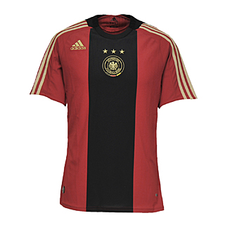
First off, the Germans may not be able to wear this fancy away kit in actual competition since there’s some law from the Geneva convention that doesn’t allow German national teams of any sport to wear a predominately black uniform (something to do with Hitler’s youth teams or his mustache, I’m not really sure). As for the shirt itself, not bad but not great, at least the fascist undertones are a little more subtle than this one:

Away Design = Coors Lite

Away Uniqueness = Coors Lite

Away Purchasability = Miller Lite

Australia Home ------------------------- Australia Away


The Soccerroos got an interesting design from the Nike people this year, and for the life of me I’m not sure how I feel about it. The last few versions of the Aussie home kit have looked conspicuously close to the Brazil home shirt, this year Nike went a whole new route, darkening both the yellow and the green tints (good) and adding a white band across the collar bone (bad). Everything about this shirt screams Project Runway – The Rugby challenge, I can hear Tim Gunn shouting at the hapless sweatshop workers: “I want you to bring rugby to the runway. Make it work!” Unfortunately this shirt just fails all over the place; at least no one will get them confused with Brazil this year…

Home Design = Bartles & Jaymes

Home Uniqueness = Summit EPA

Home Purchasability = Bartles & Jaymes

The away shirt for Kanga and her Roos is the same horrible template as the home shirt (whatever happened to Nike experimenting with the away shirts…?), but for some reason I find myself liking this exponentially more. The two different tones of navy separated by a yellow stripe is still very rugby union, but decent to look at. Plus dark navy blue, like black, will help to hide some of my excess gut.

Away Design = Miller Lite

Away Uniqueness = Summit EPA

Away Purchasability = Summit EPA

Serbia Home ------------------------ Serbia Away


The obvious inspiration for Serbia’s home shirt is the old Inter Milan shirt. The offset white cross on the red background is very unique in this year’s cup and looks quite slick. The only problem I have with the whole get up is the royal blue shorts, makes them look like a bad 4th of July outfit.

Home Design = John Smith’s Extra Smooth

Home Uniqueness = John Smith’s Extra Smooth

Home Purchasability = John Smith’s Extra Smooth

Unfortunately Nike spent too much time designing the Serbian home shirt, and didn’t get started on it until about 30 minutes before it was due. There’s way too much white on this shirt, especially when you add the white of the cross in the crest. Yawn.

Away Design = Bartles & Jaymes

Away Uniqueness = Bartles & Jaymes

Away Purchasability = Bartles & Jaymes

Ghana Home --------------------------------- Ghana Away


Again Puma gives us a turd of a kit, the only redeeming part is the sublimated black star on the shoulder.

Home Design = Bartles & Jaymes

Home Uniqueness = Coors Lite

Home Purchasability = Bartles & Jaymes

For the Ghanaian away shirt, Puma sticks with the “unique brushstrokes” of loud and audacious colors, and like Algeria’s away kit, this one is pretty sharp. I personally don’t think I can pull of red and yellow vertical stripes, but it won’t look bad on the field.

Home Design = Miller Lite

Home Uniqueness = Miller Lite

Home Purchasability - Summit EPA

Next week.... Groups E,F,G, and H!

Bookmark and ShareSupport the Movement. Get the Free Beer Movement T-Shirt. Only from Objectivo.com

Wednesday, June 2, 2010

Beer-tastic World Cup Jerseys: Group C

3 comments
By Nick Sindt

Here we are! Just nine days to the greatest sporting spectacle the world has ever seen. No... not the monster truck rally at your local convention center. The World Cup! The pageantry, the globe's greatest teams and players, the crazed and delusional fans (looking at you, England).

But what about the team's jerseys? Every four years, and sometimes even more frequently, the National teams of nearly every country roll out new threads for materialistic consumers to salivate over and spend their hard earned dollars, yen, Euros, etc on.

How will you ever sort through all of them to decide which jersey you'll treasure for the next month?

Worry no more! The Free Beer Movement's Nick Sindt is going to walk you through all 32 teams' home and away jerseys and rate them based on (what else?) beer!

Previous Groups:
Group A
Group B

Here’s how the ratings will work; I’ll be ranking each kit on its design/uniqueness and purchasability (from a home fan’s standpoint) and the rankings will of course be done in beers as follows:

John Smith’s Extra Smooth = An Excellent design that deserves to be toasted with a fine beer; you don’t need to pound these back to look at it, but it’s beer and it’s the World Cup so we know you’re going to.

Summit [Insert Local Brewery Name Here] Extra Pale Ale = A solid design though it may not satisfy everyone’s pallets. You’ll only need two or three of these excellent brews before you lose your inhibitions and purchase the kit online in the middle of the night.

Miller Lite = A shallow and pedantic effort by one of the “big names” in the world, but it’s still an average beer/your national team’s kit so you can’t hate it, right?

Coors Lite = Thankfully Coors tastes and goes down like water because you’ll be drinking a lot of it to drown out the abomination that is this iteration of your team’s kit.

Bartles & Jaymes = Shennaigannery! Travashammockery! This kit is such an abomination you’d rather punish your liver, taste buds, and stomach with a wine cooler.

Group C

England Home ------------------------ England Away


(Ed Note: Tee hee hee... we put in the women's and baby's kit!)

Similar to Uruguay’s Home kit, I don’t know whether I should wear this to pub when watching a match or out to the links; though, this versatility does up the purchasability value of the shirt. My biggest complaint about the home kit for the Three Lions this year is not necessarily the shirt, but the fact that the shorts and the socks are both solid white. Also, they’re cut in a such a way that it makes Wayne Rooney look like an overweight dock worker trying to cram his ten pounds of garbage into a five pound bag. My second biggest beef with this year’s England kits is that the Championship star is the same color as the shirt, instead of the usual gold, so it doesn’t stand out; something to do with wearing similar shirts to those worn in 1966 when England last tasted some glory in International Footie.

Home Design = Miller Lite
Home Uniqueness = Miller Lite
Home
Purchasability = Summit EPA


England’s away kit is…..[dozing off and drooling on keyboard]. The retro theme I s big this year and Umbro/England definitely crapped the bed with this attempt; someone should tell them that retro doesn’t mean exactly like it was 44 years ago.

Away Design = Bartles & Jaymes
Away Uniqueness = Coors Lite Away
Purchasability = Bartles & Jaymes


United States Home ----------------------- United States Away


Here she is Miss America! It’s line that we’ve heard many, many times since seeing the leaked photos of this kit. In crazyland (Beaverton, Oregon) the grey sash is supposed to bring our collective conscious back to the white shirt with red sash that the US wore when they beat England back in 1950. That is half-way believable at best. Though I was initially repulsed by it, the home kit has started to grow on me a little; I no longer wish to cut myself when thinking about it. Unfortunately this shirt is paired with white shorts and white socks, and I am not a fan of teams dressing in solid white, it just looks like a bunch of girlie-men running around out there. Throw on the blue shorts instead of the white and this kit is starting to be halfway decent.

Home Design = Coors Lite
Home Uniqueness = Miller Lite

Home Purchasability = Coors Lite


Same as the home except in different colors, how novel of an idea! As the US home kit has started to grow on me, this away offering has started to become more detestable. At least the sash was somewhat subtle in the home kit, here Deuce looks like a crossing guard (a scary one, but one none-the-less). Seeing this one launched in the March 3rd contest against the Dutch, and worn on a few fans at the Minnesota Stars game the other night, the Navy Blue looks almost purple which pansifies the look even more. Going with the blue shorts and socks helps pull it together, but I’m still not sold on it. It seems that Nike has done everything in their power this time around to make all of their shirts just middle of the road enough that no one will love them and no one will hate them.

Away Design = Coors Lite
Away Uniqueness = Coors Lite

Away Purchasability = Coors Lite


Algeria Home ----------------------- Algeria Away


Everyone (kit nerds at least) fly off the handle about Nike using the same template and switching out color schemes. Have they even looked at Puma’s shirts for this, or any, World Cup? Alergia’s home shirt could be any African nations’ shirt except for the crest and the lone cool feature of the shirt; a sublimated thingy that’s representative of each nation’s identity. This picture isn’t sharp enough to discern what that may be for the Algerians (a fox maybe?), but it’s a cool idea.

Home Design = Coors Lite
Home Uniqueness = Miller Lite

Home Purchasability = Coors Lite


Puma’s away kits for all of the African nations will follow the same template as well except this time the colors of the shirts will be insanely bright (think of the bad mid-to-late-90s movement of African-American’s returning to Africa which was popularized in many TV shows) brush stroke effect which is supposed to mimic fans’ body paint. This brush stroke effect is supposed to be unique, maybe someone should remind Puma that to be truly unique they shouldn’t use the same design ethos for all of their African teams. Still this shirt is a lot cooler than the plain ol’ home shirt they’ll be sporting, and the color choices are something you don’t see every day in international soccer.

Away Design = Miller Lite
Away Uniqueness = Summit EPA

Away Purchasability = Summit EPA


Slovenia Home ------------------------ Slovenia Away


Multiple choice question - The thingy on the Slovenia Home and away shirt pays homage to:

A. A mountain range seens somewhere within Slovenia’s borders
B. The US Stock Market in the last 30 years
C. Charlie Brown’s shirt

Actually, it loosely depicts the Slovenian Coat of Arms which is found in their flag, which probably references Mount Triglav, the highest point in the country. Where I’m lost is how a very Russian looking flag (red, white, and blue are the dominant colors) gives us white/forest green and forest green/highlighter yellow kits…I digress. Nike again uses a basic template and tosses on a little national uniqueness. Not a horrible effort, but still rather plain, plus it’s a knock-off of the last time the Slovenes made the WC Finals in 2002, and that kit was made by some random company that’s probably defunct now because the World & US economies have followed the lines on the shirt itself.

Home Design = Coors Lite
Home Uniqueness = Summit EPA
Home Purchasability = Miller Lite


Everything I said for the home shirt goes for the away shirt, except this time around Nike has used highlighter yellow as the compliment color instead of plain white. Definitely a nice touch that makes this kit more tolerable than the home shirt. I’m not condoning the use of Jorge Campos neons again, but it’s different enough that it would be worth buying if you find yourself on vacation in Slovenia.
Away Design = Coors Lite
Away Uniqueness = Summit EPA

Away Purchasability = Miller Lite


Tomorrow: Group D!

Bookmark and ShareSupport the Movement. Get the Free Beer Movement T-Shirt. Only from Objectivo.com